Work

Brand identities and creative direction for global brands.

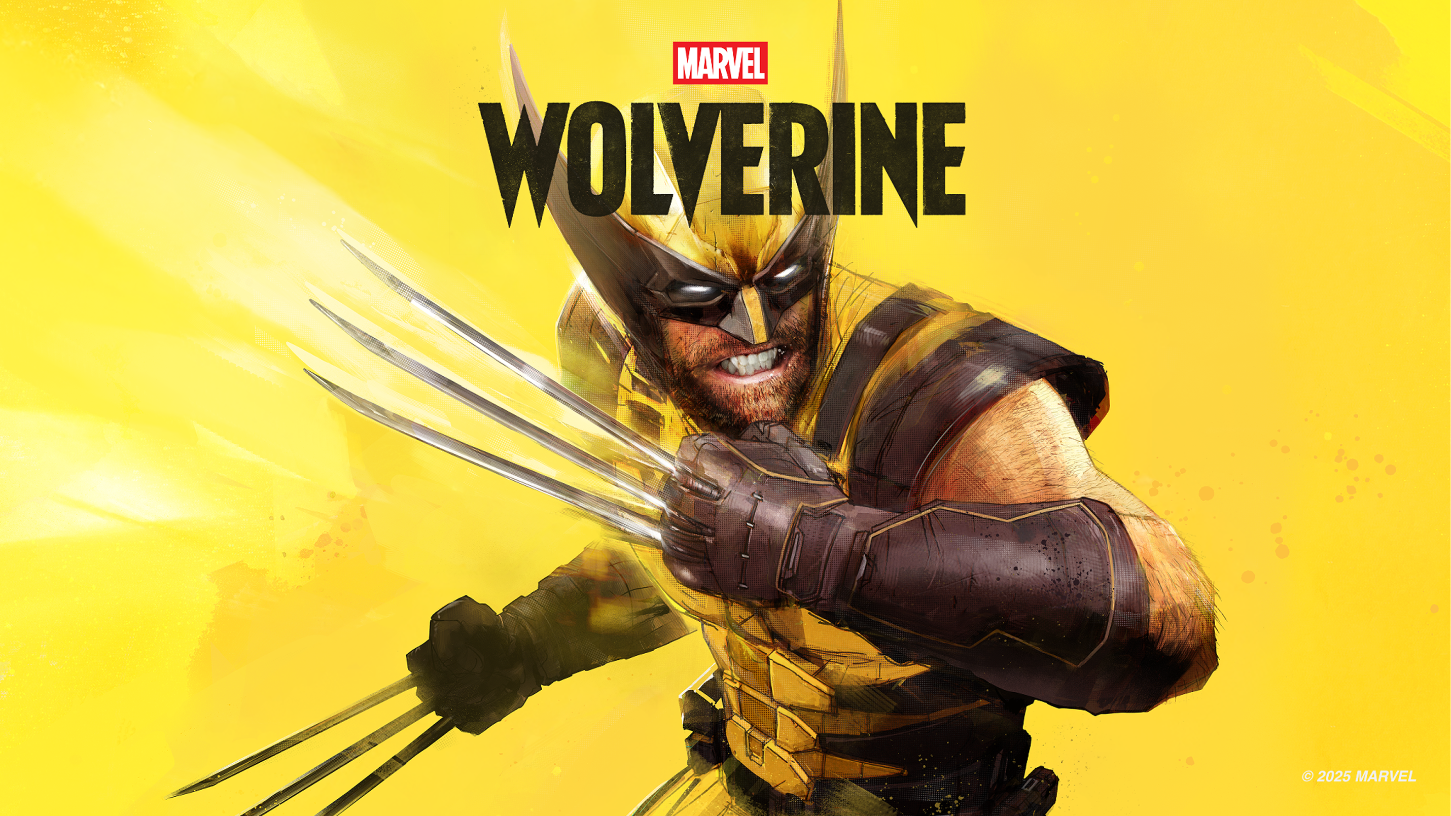
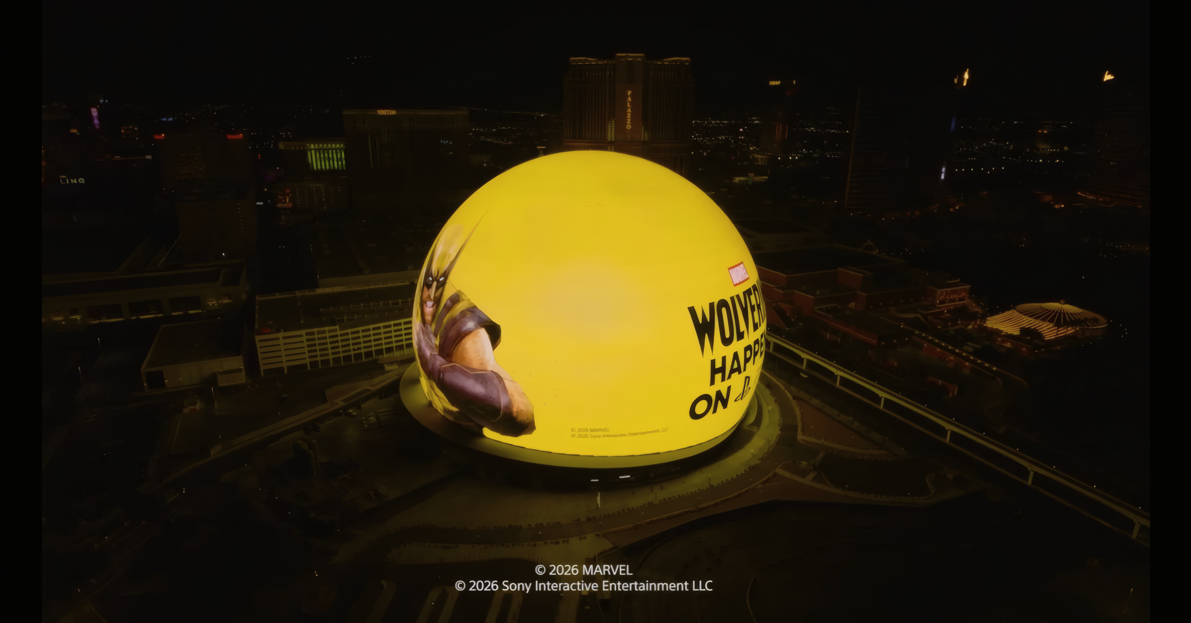
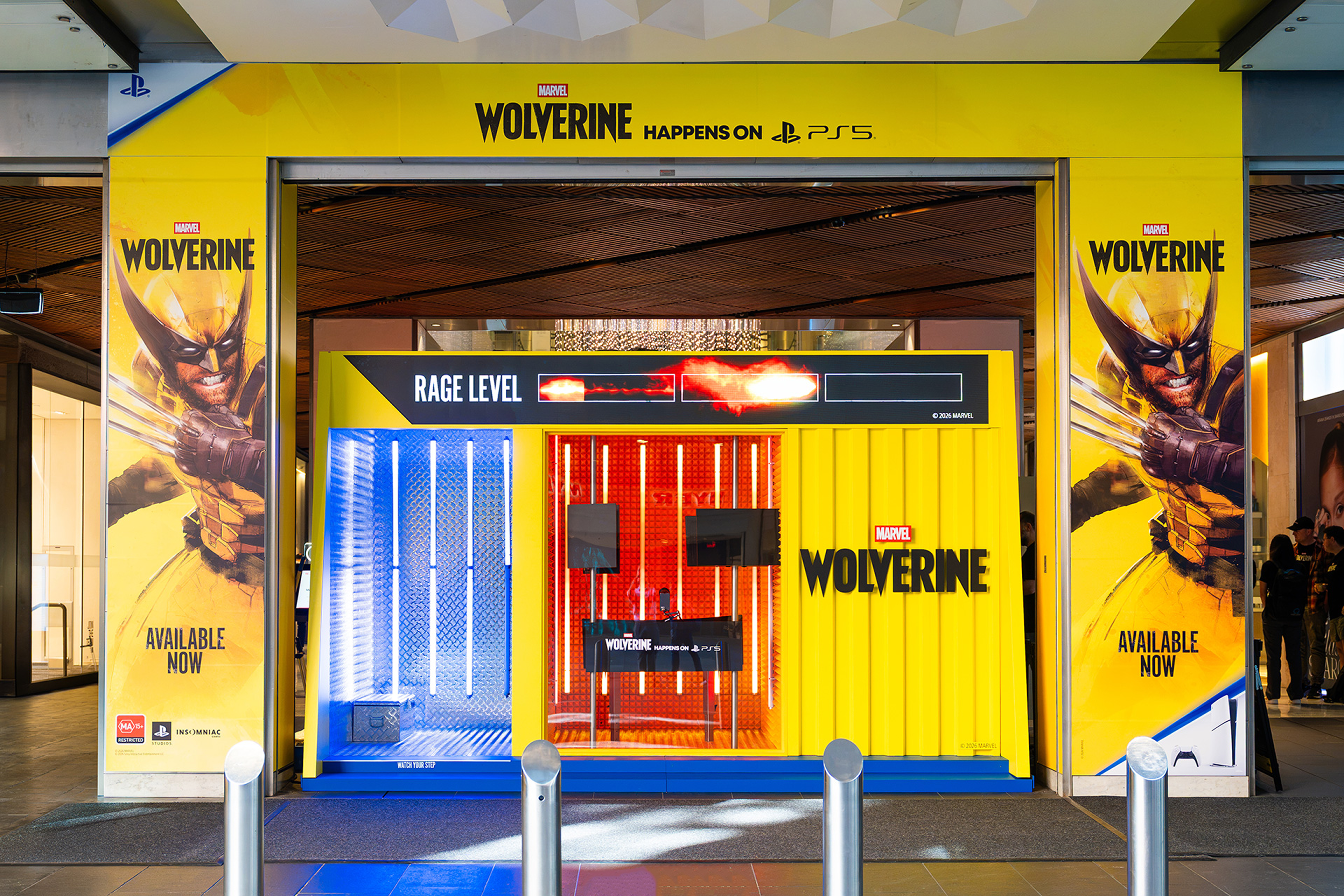
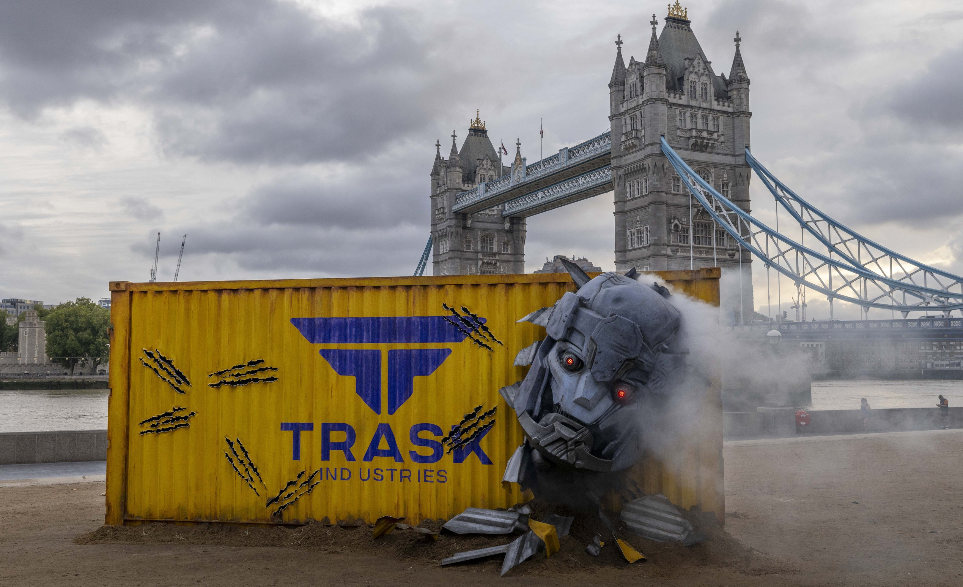
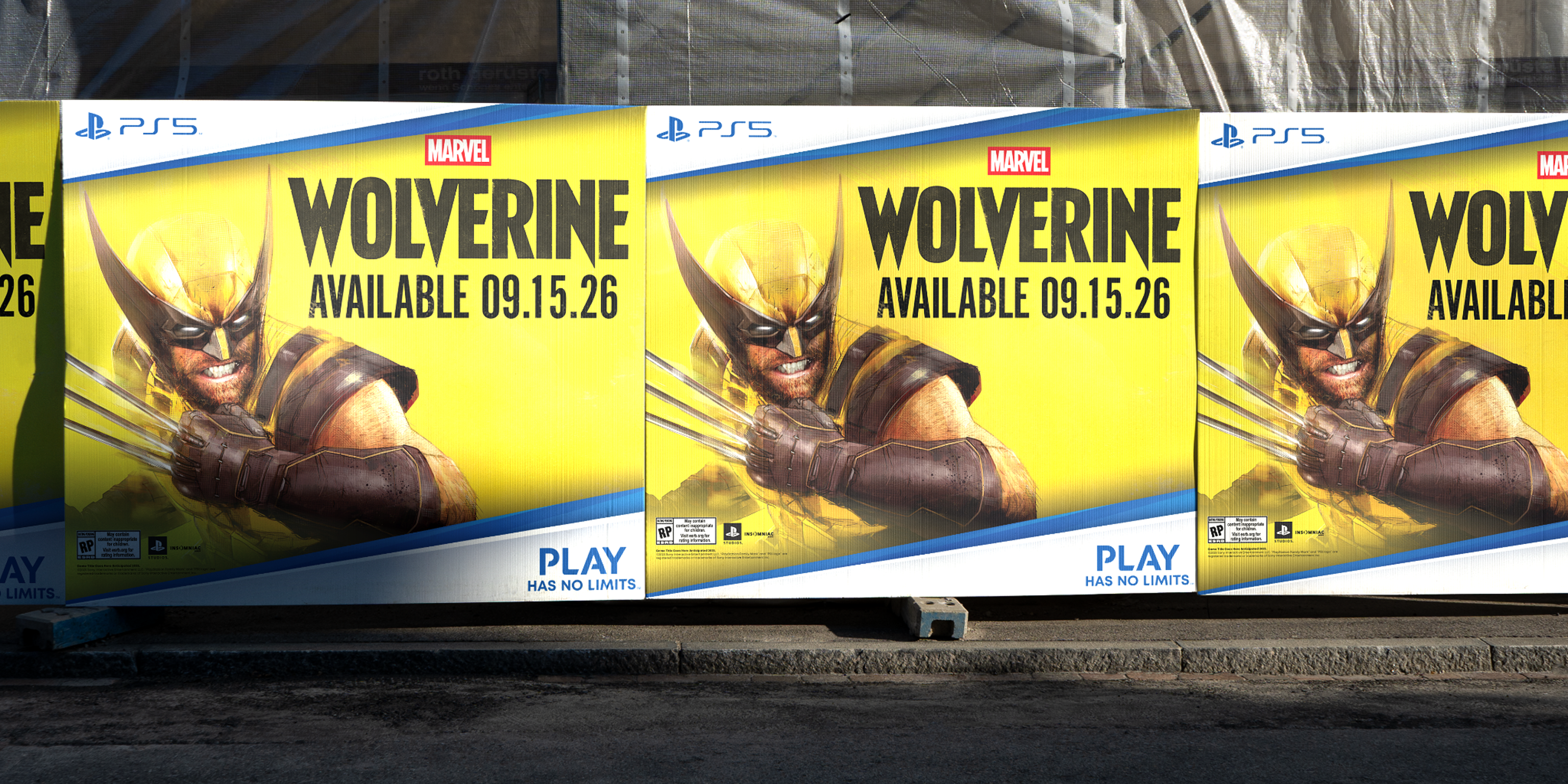
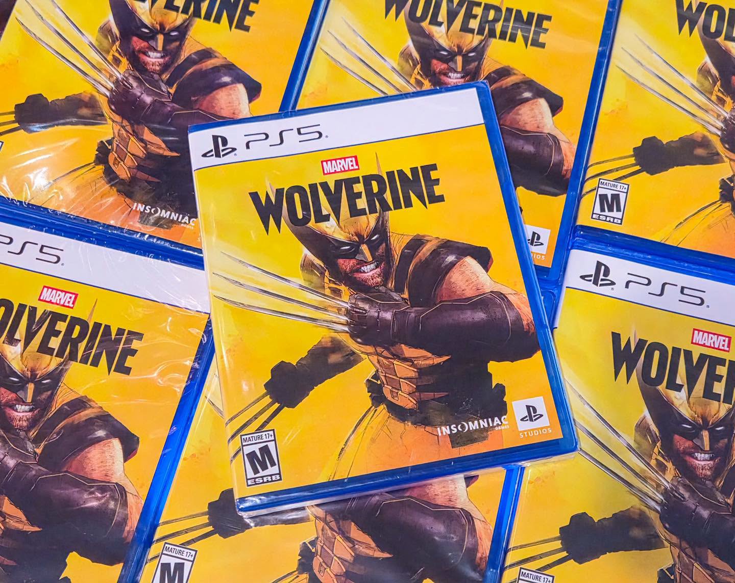
Marvel's Wolverine key art full view Wolverine OOH campaign Wolverine global campaign Wolverine key art final Wolverine campaign detail Wolverine hero
Wolverine Art Direction · Campaign

PlayStation's first first-party Wolverine game needed more than marketing — it needed a platform. We defined Don't Call Me a Hero, the creative territory and visual language behind the global launch campaign.

See Project
Redo logo on a green gradient background Person using a tablet in a bright room Typographic specimen of the letters Aa
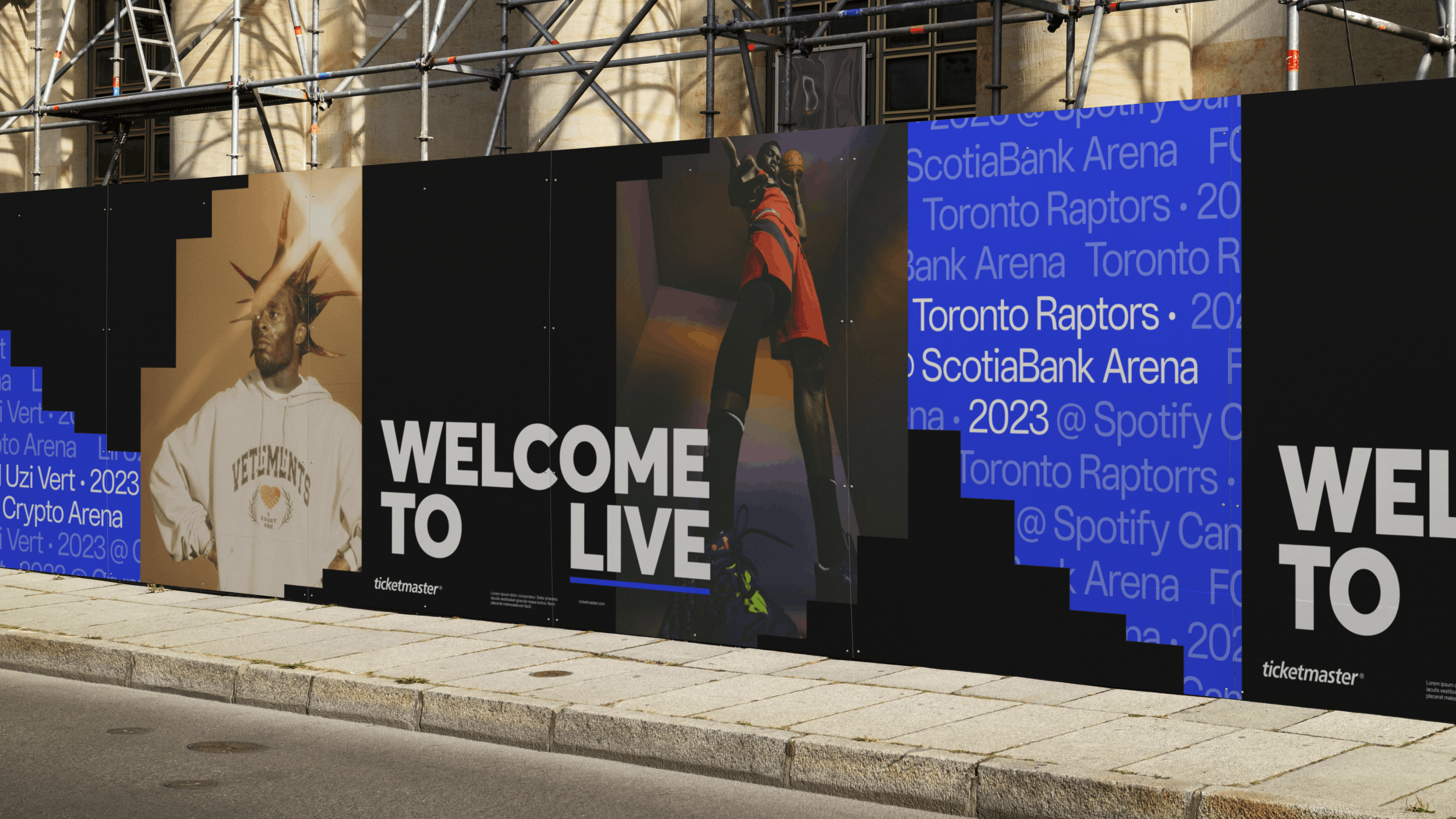
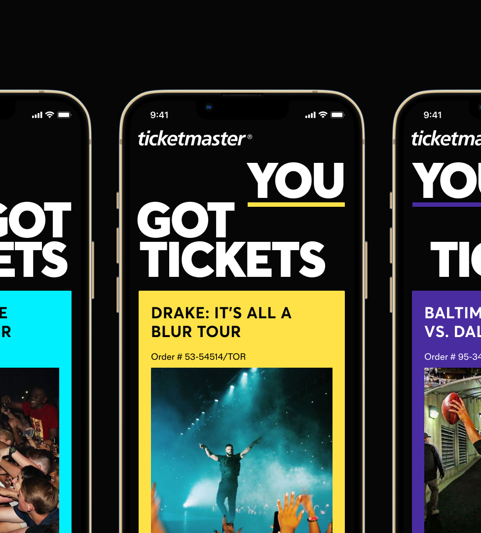
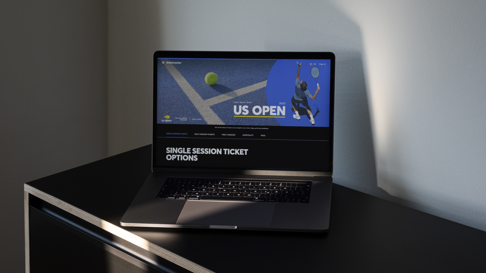
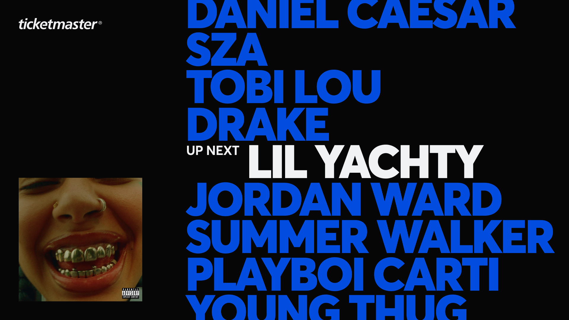
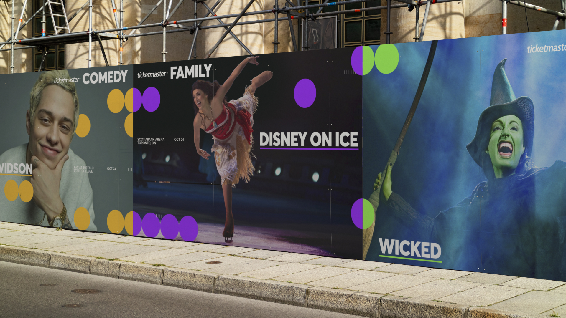
Ticketmaster Branding · Digital Design

One of the most recognized brands in live entertainment needed a unified system — not a reinvention, but a framework to carry its energy consistently across partnerships, formats and global markets.

See Project
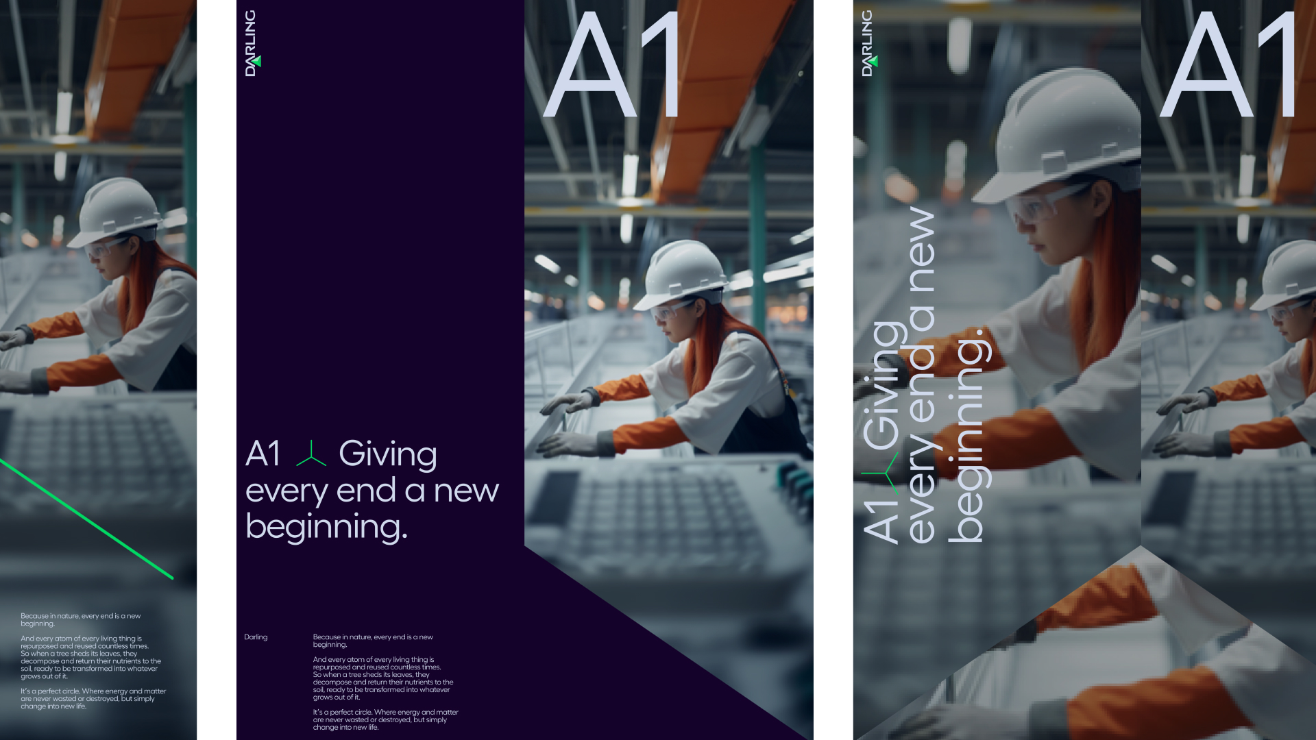
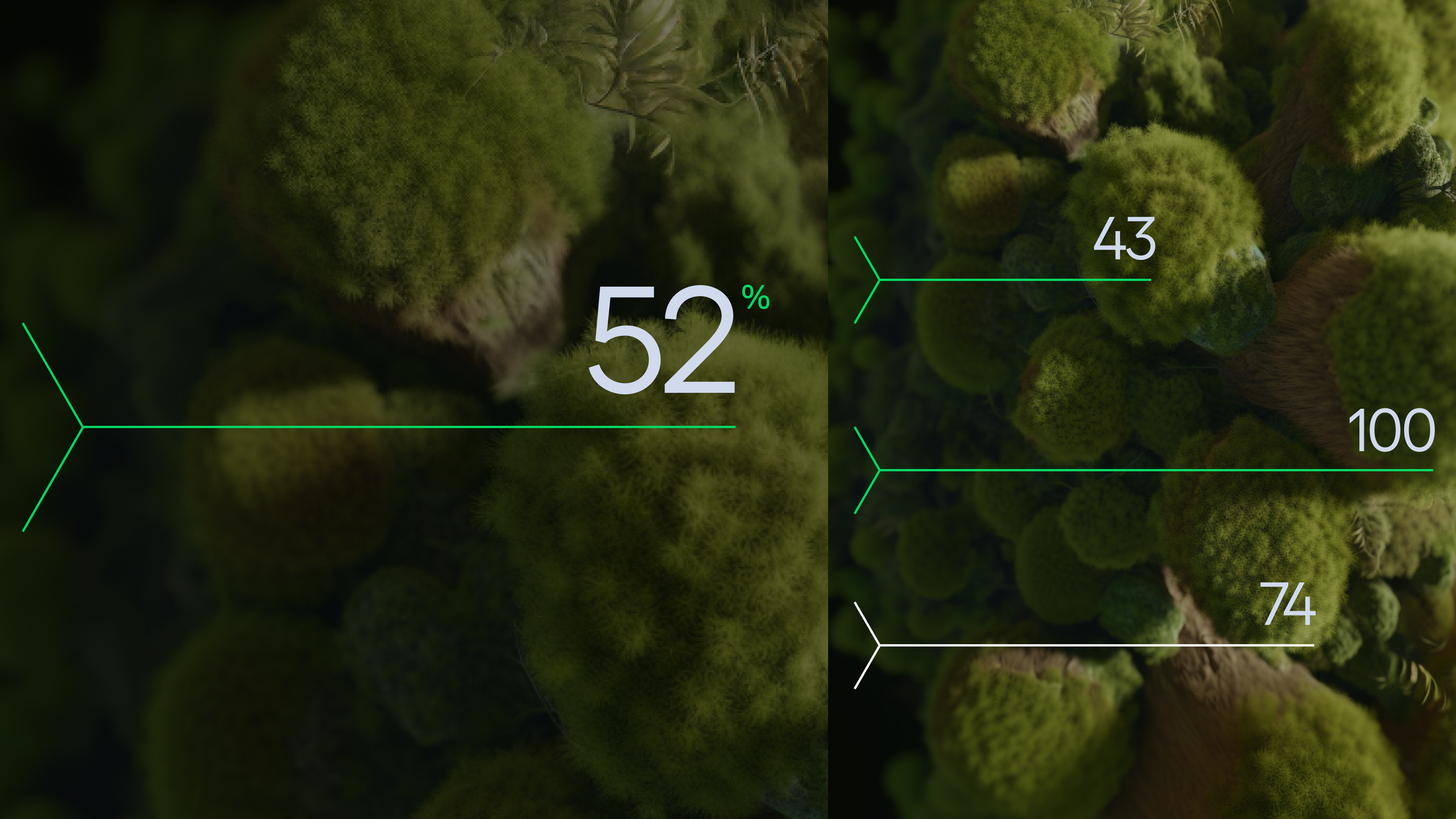
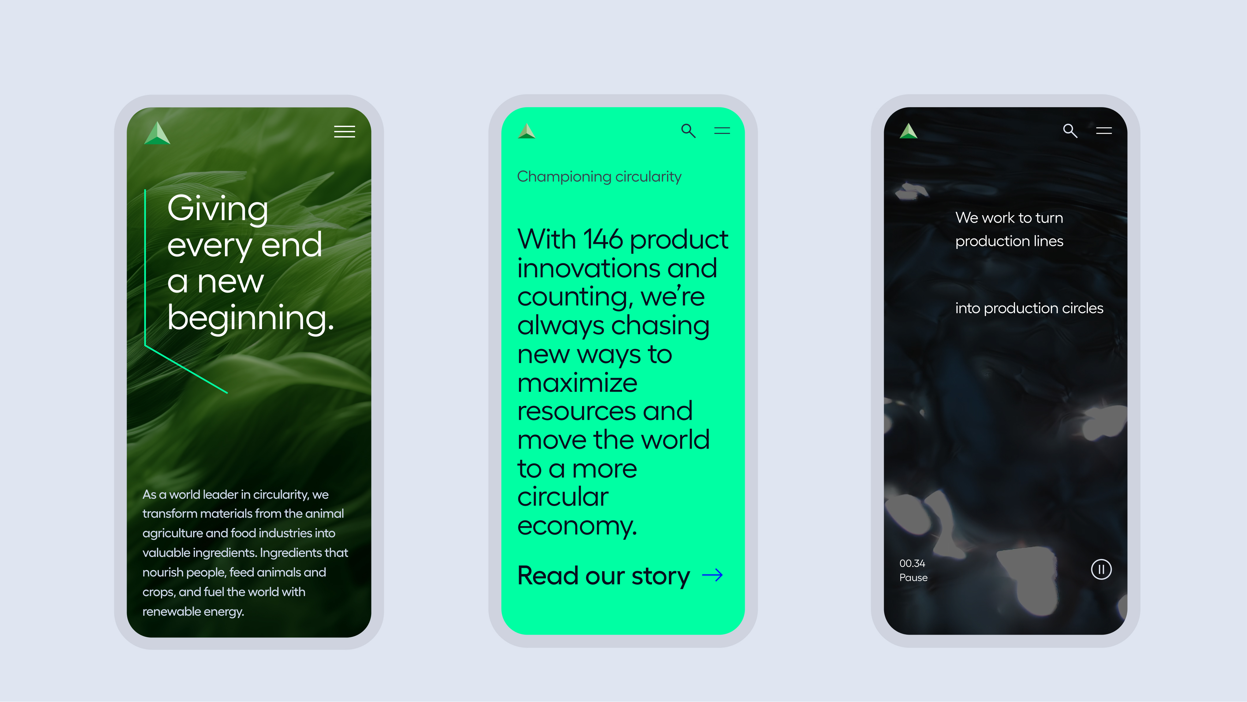
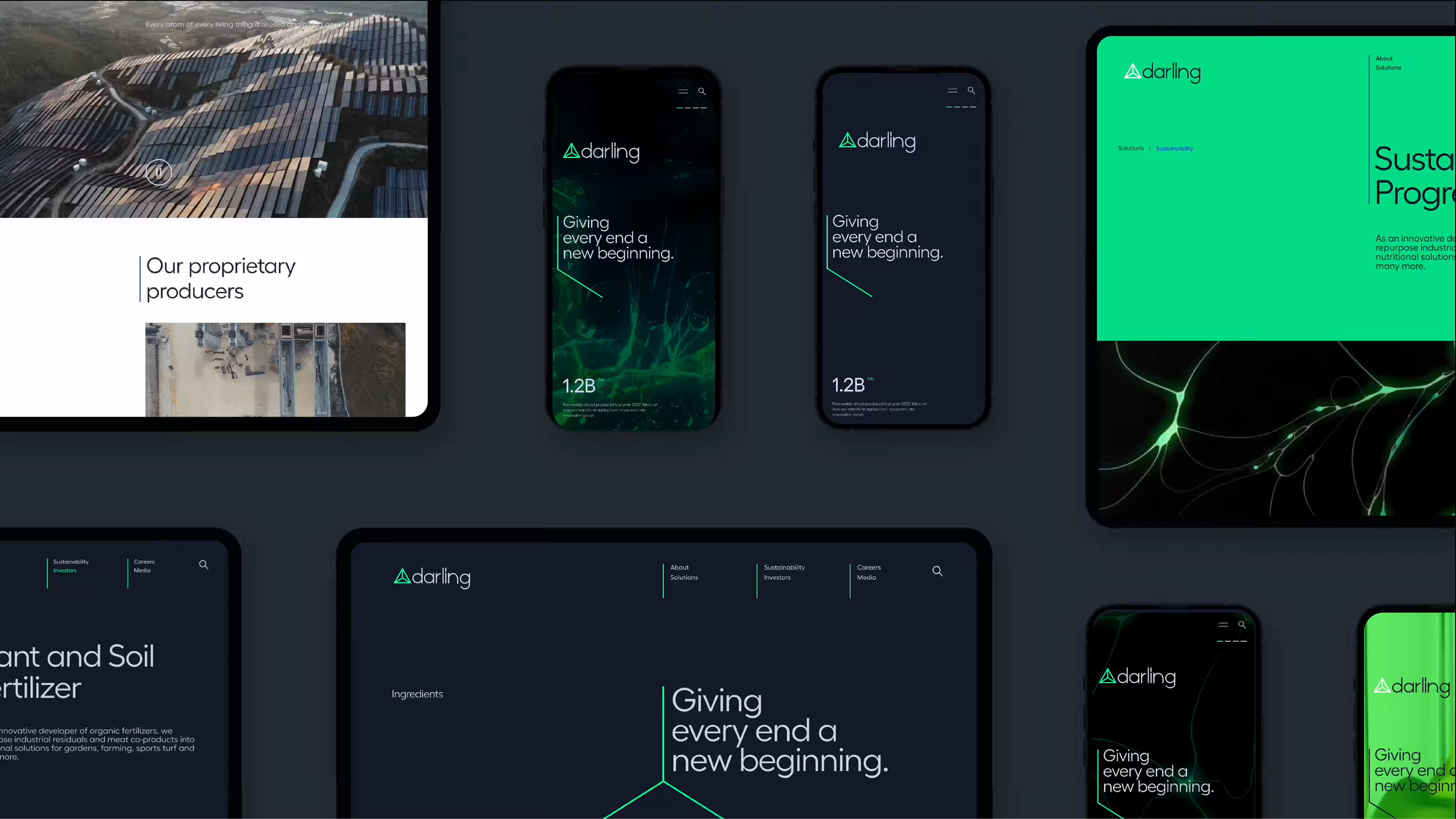
Darling Ingredients brand identity Darling Ingredients brand motion Darling Ingredients campaign visual
Darling Ingredients Branding · Design System

One of the world's largest sustainable ingredient companies — and almost no one knew it. The work unified a complex global business under a single brand narrative, built to communicate its scale and impact to investors, talent and the market.

See Project
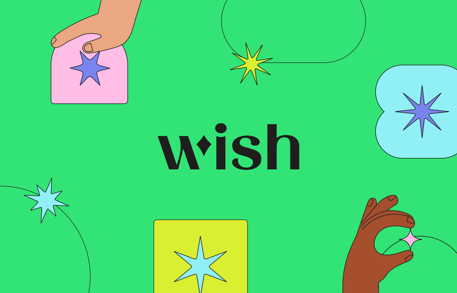
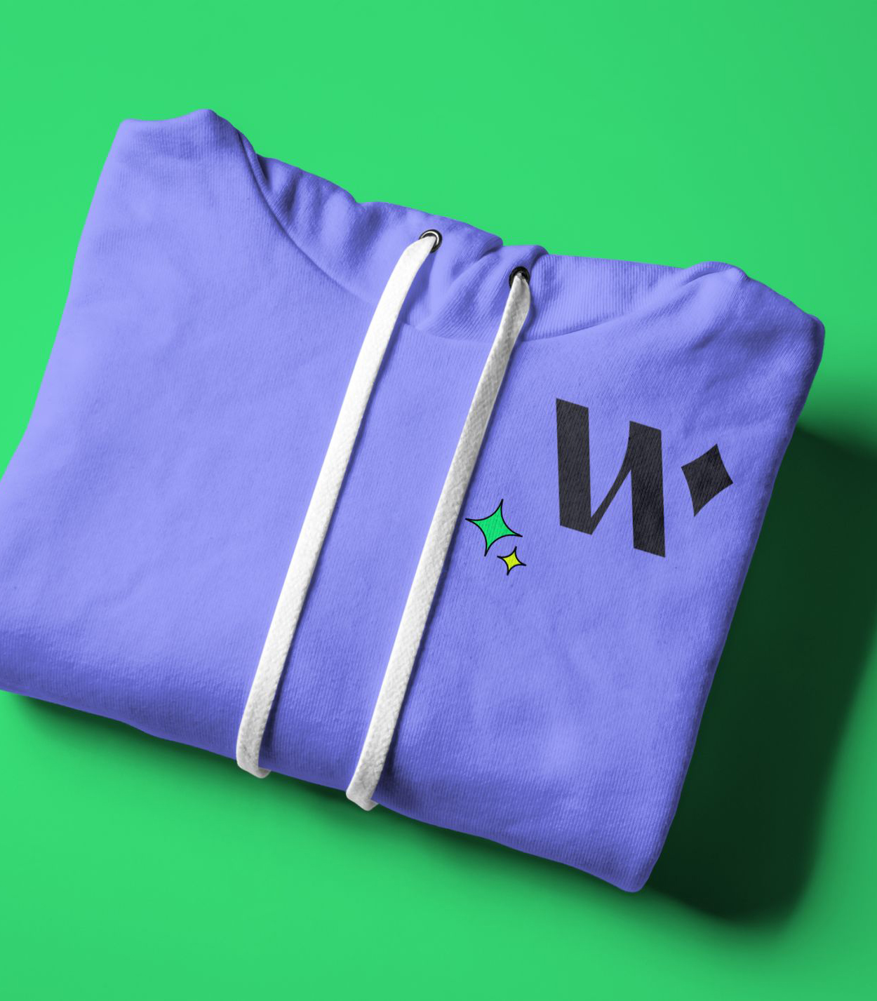
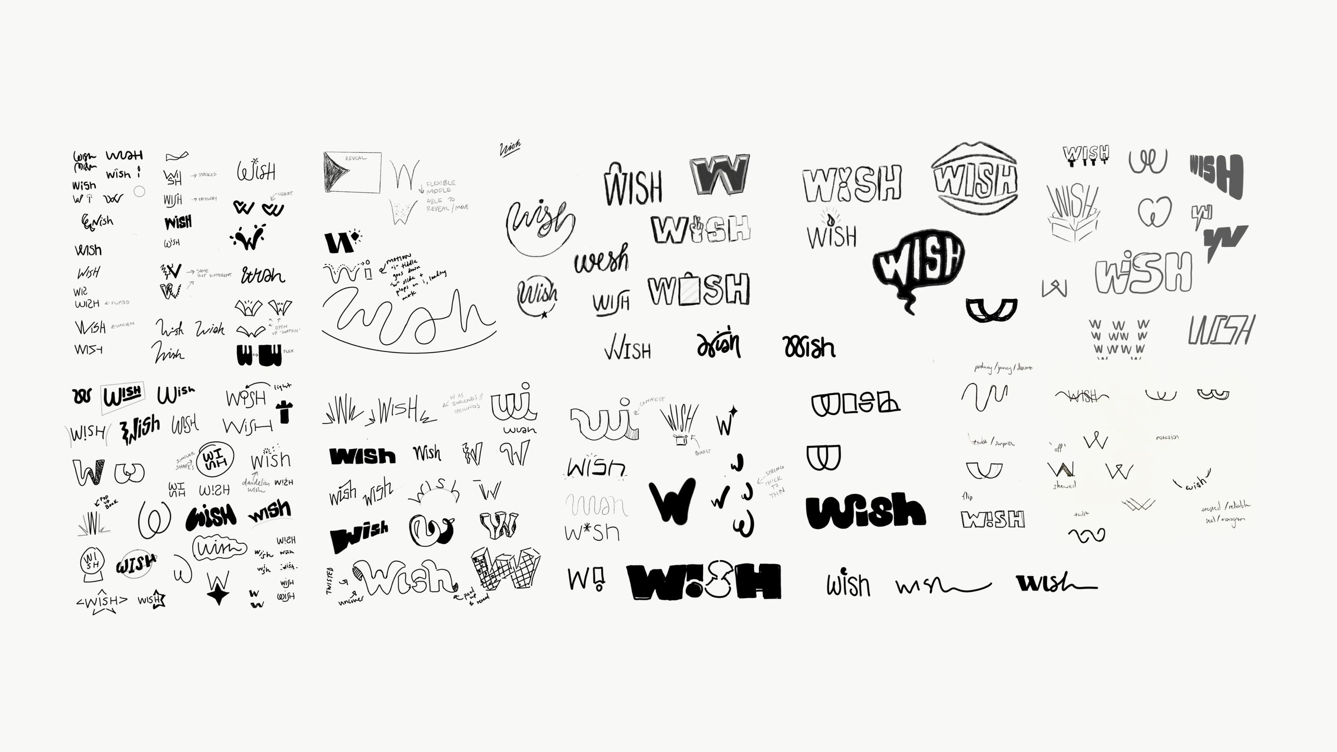
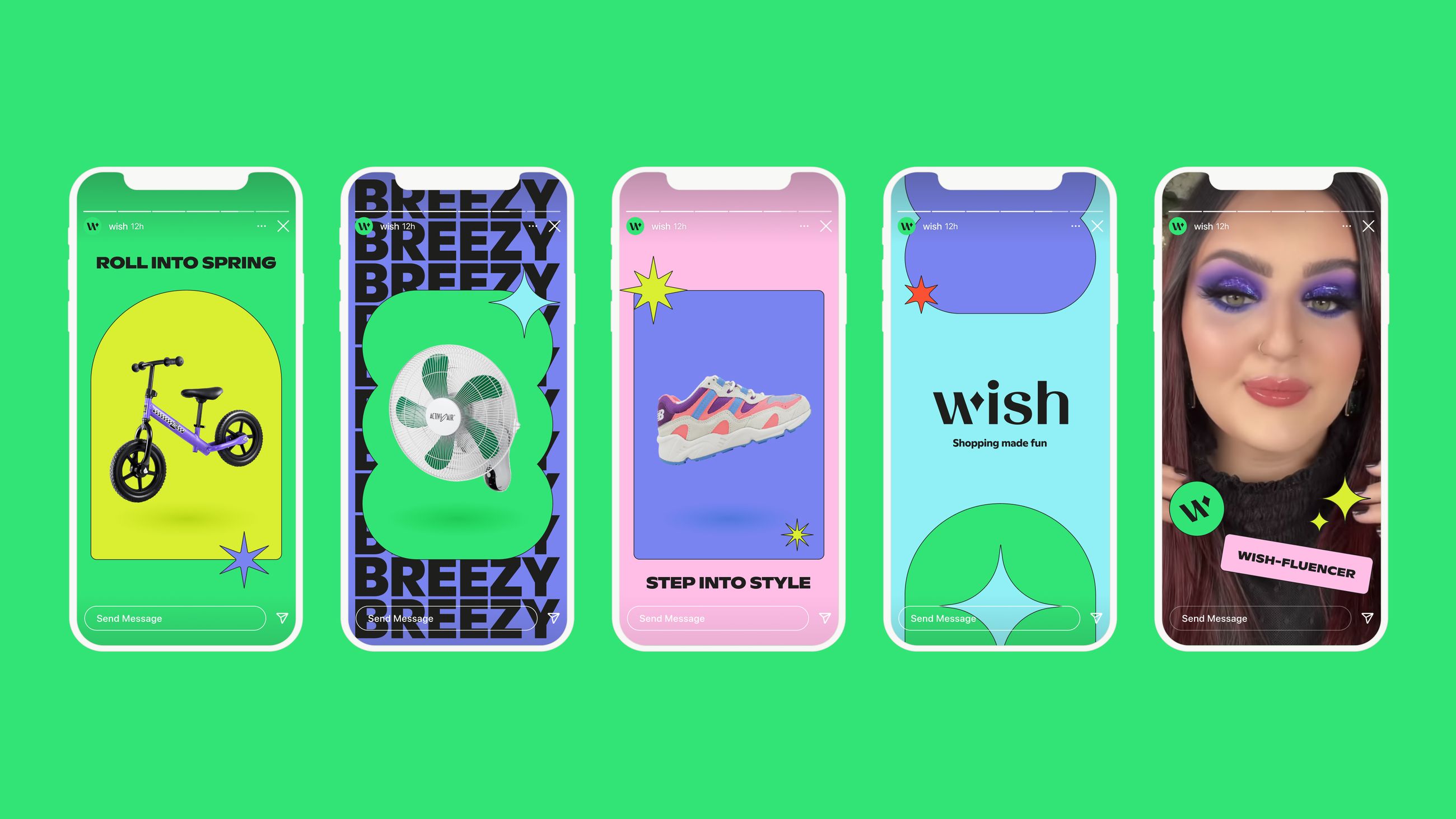
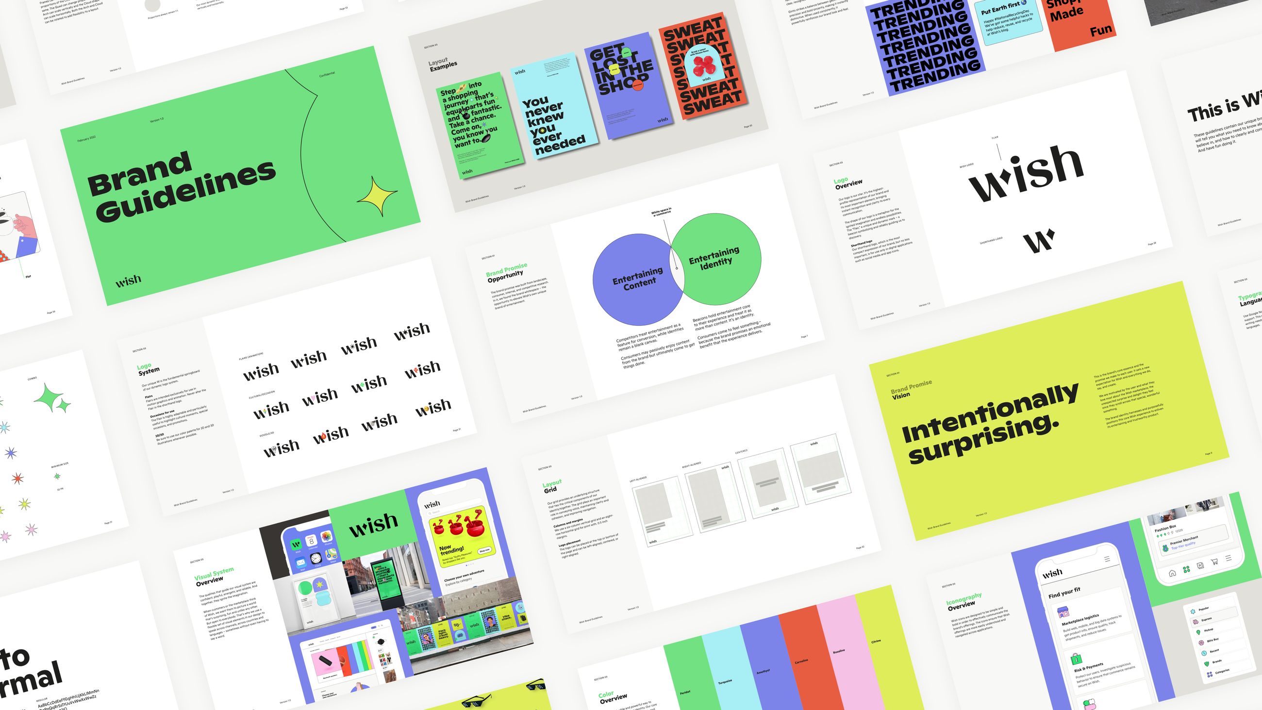
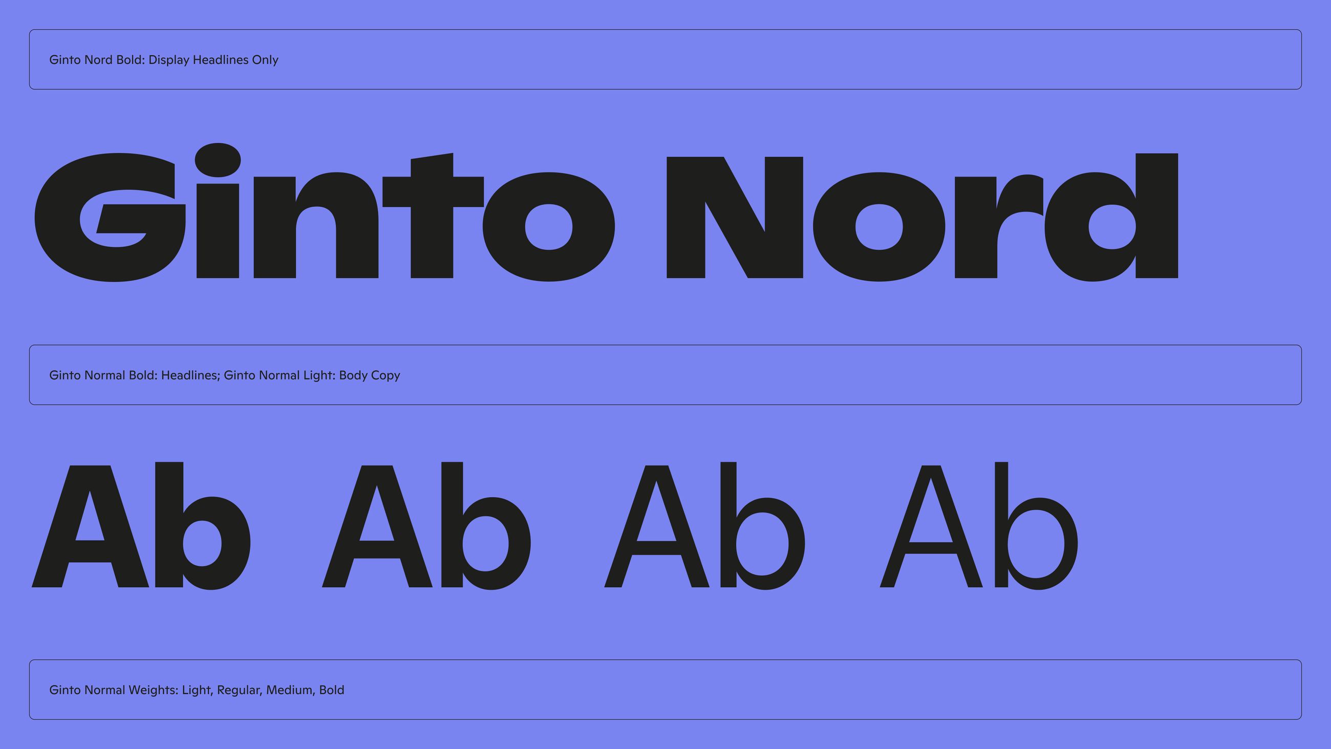
Wish brand imagery Wish brand photography Wish brand system
Wish Branding

A major platform overhaul gave Wish the opportunity to rebuild its brand from the ground up — bolder, more expressive, built for a generation that shops through its phone.

See Project
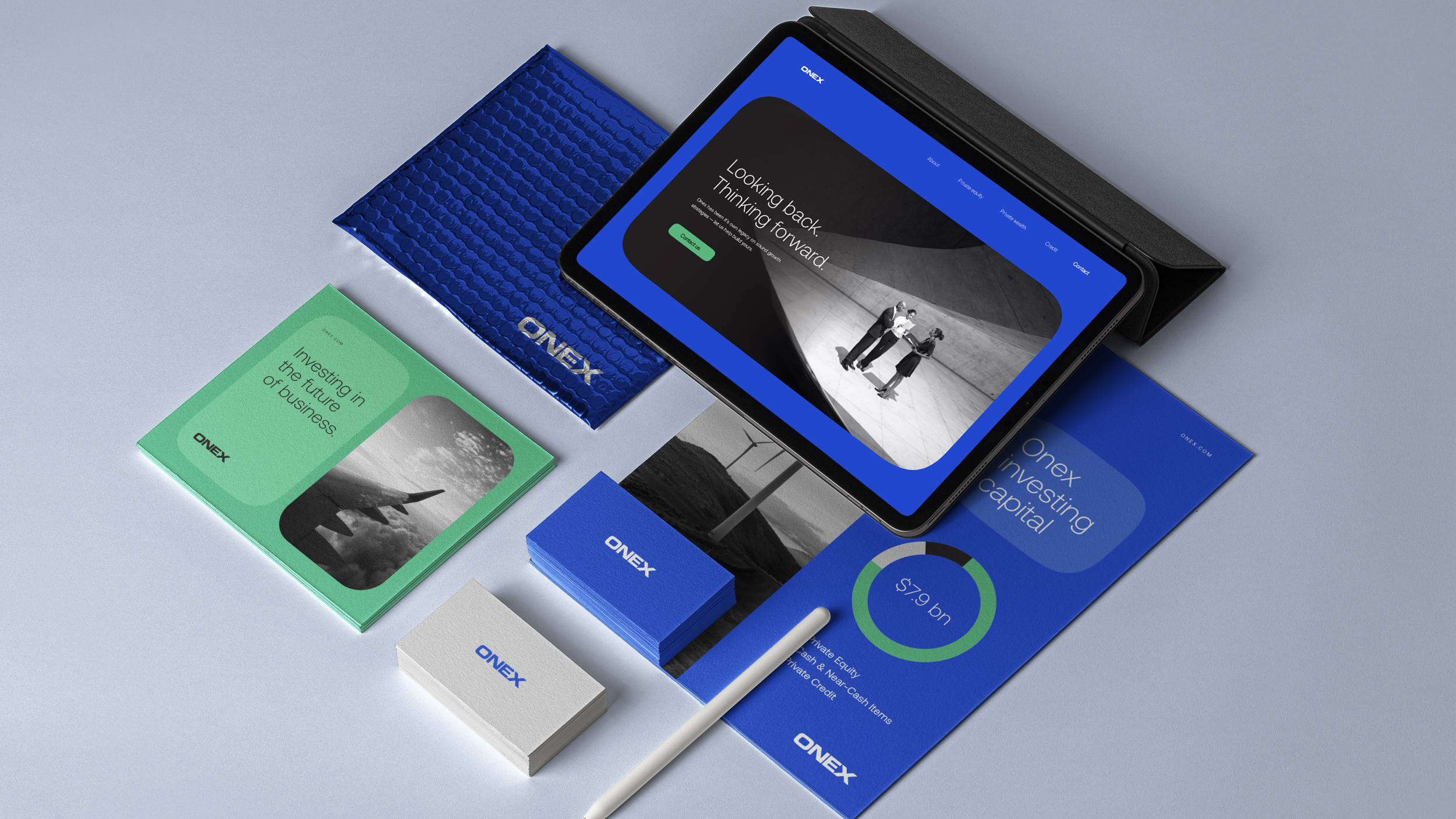
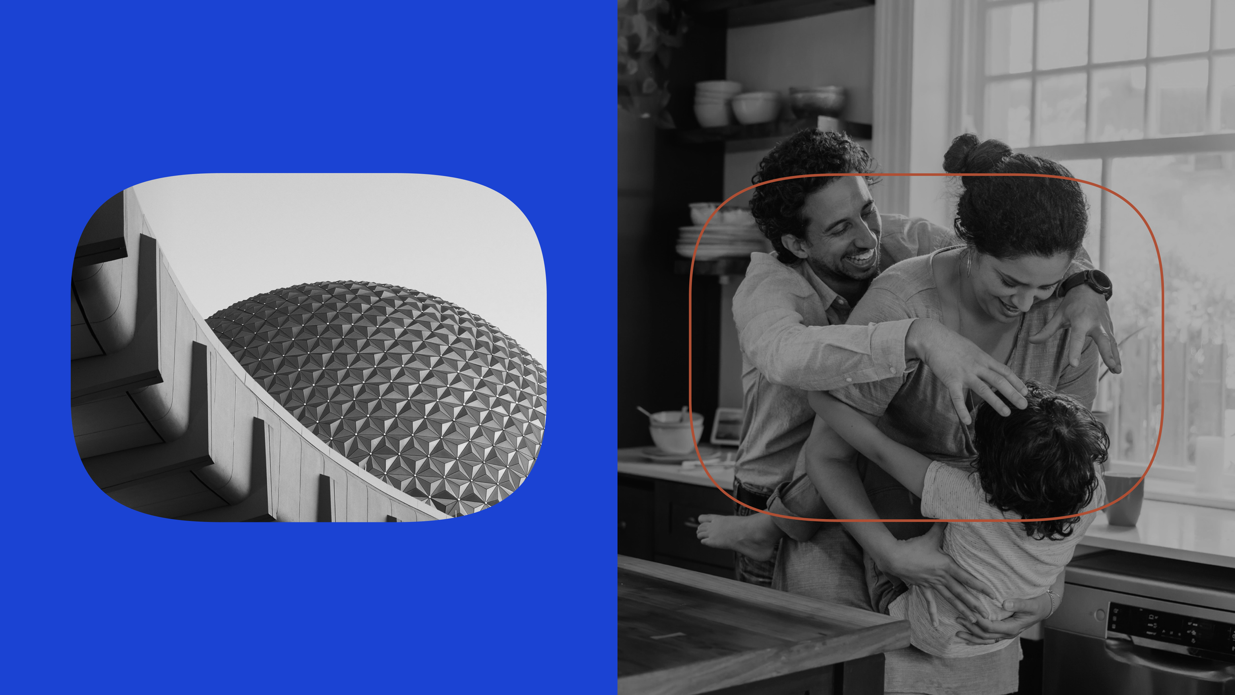
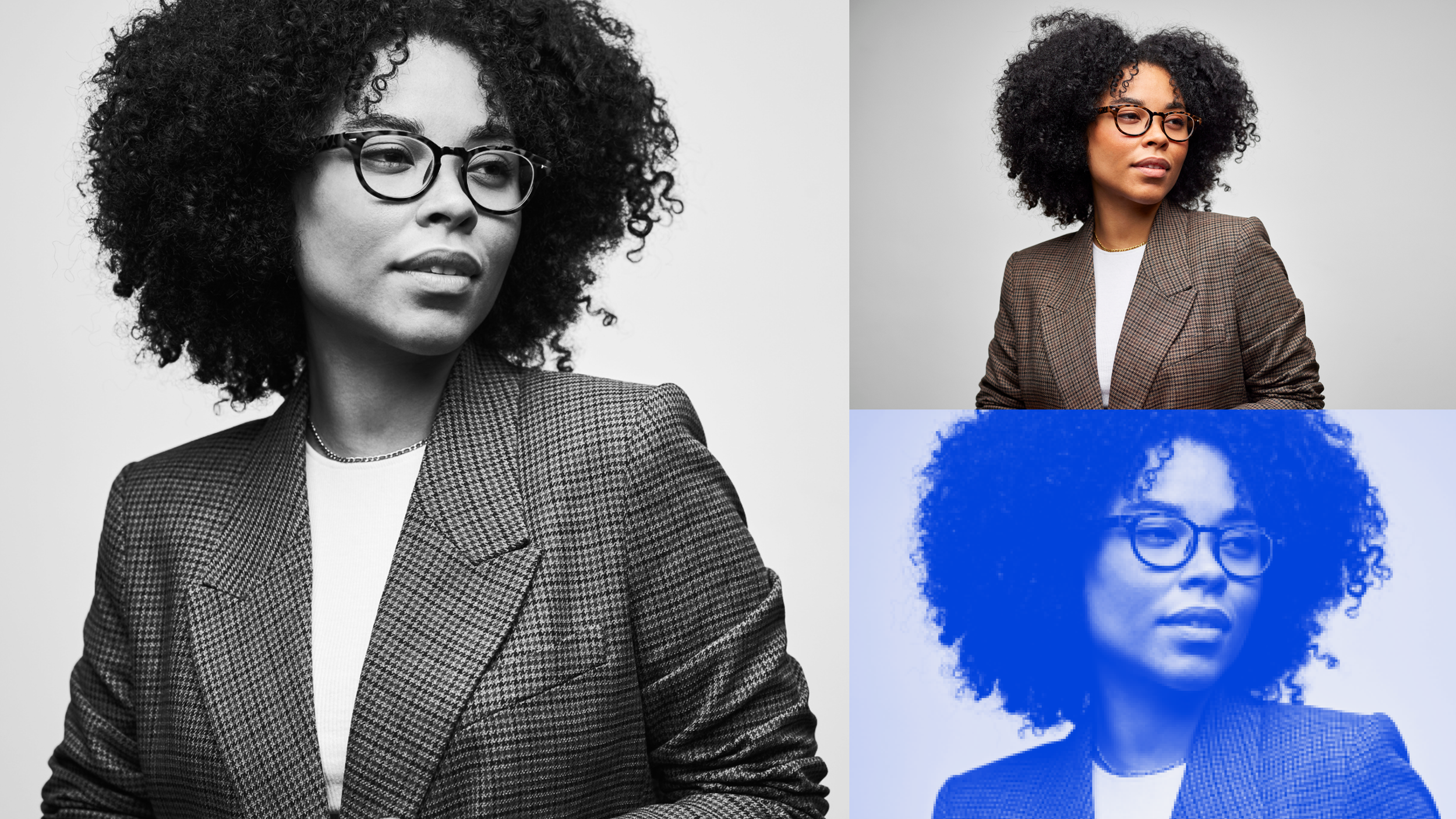
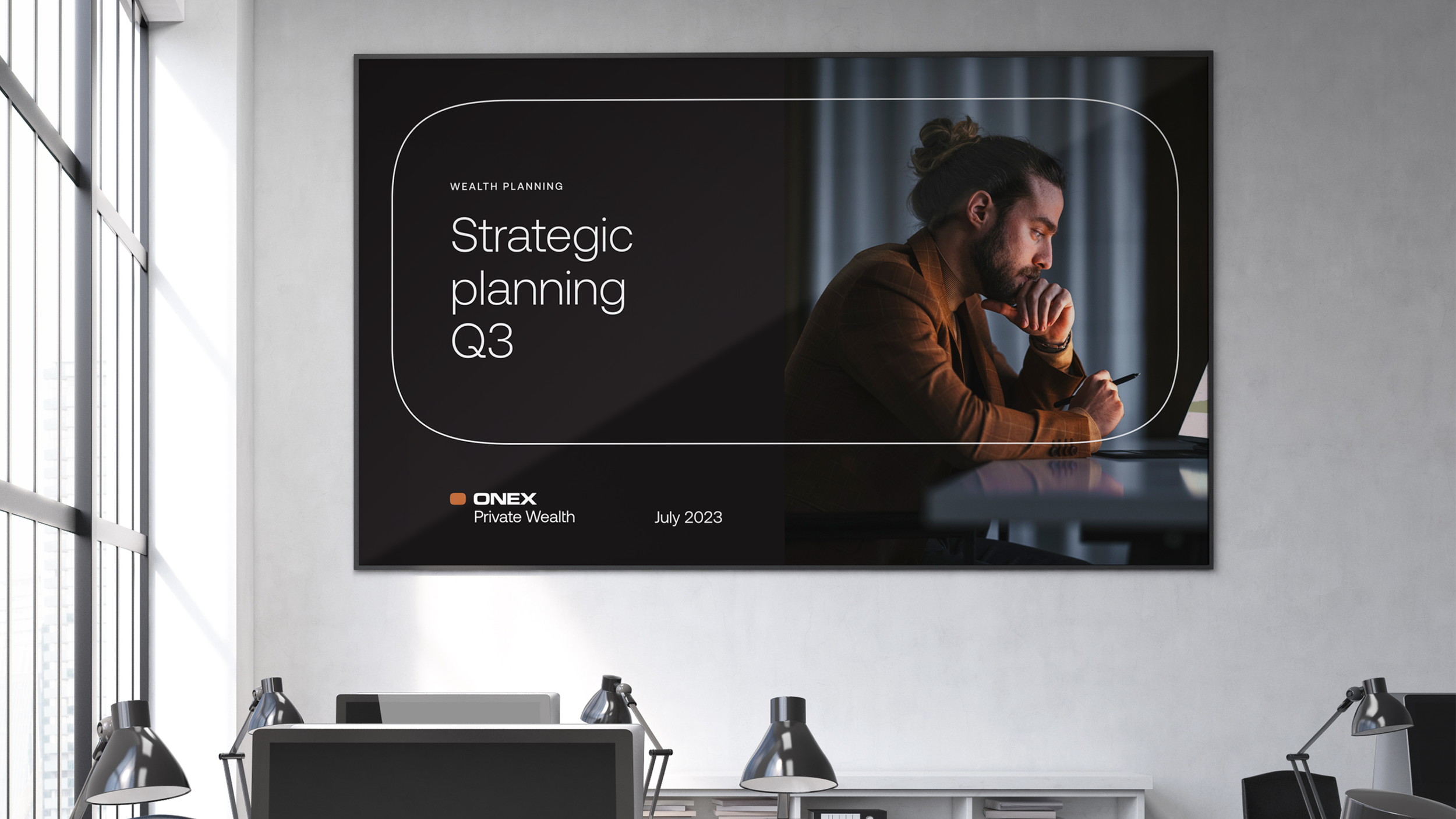
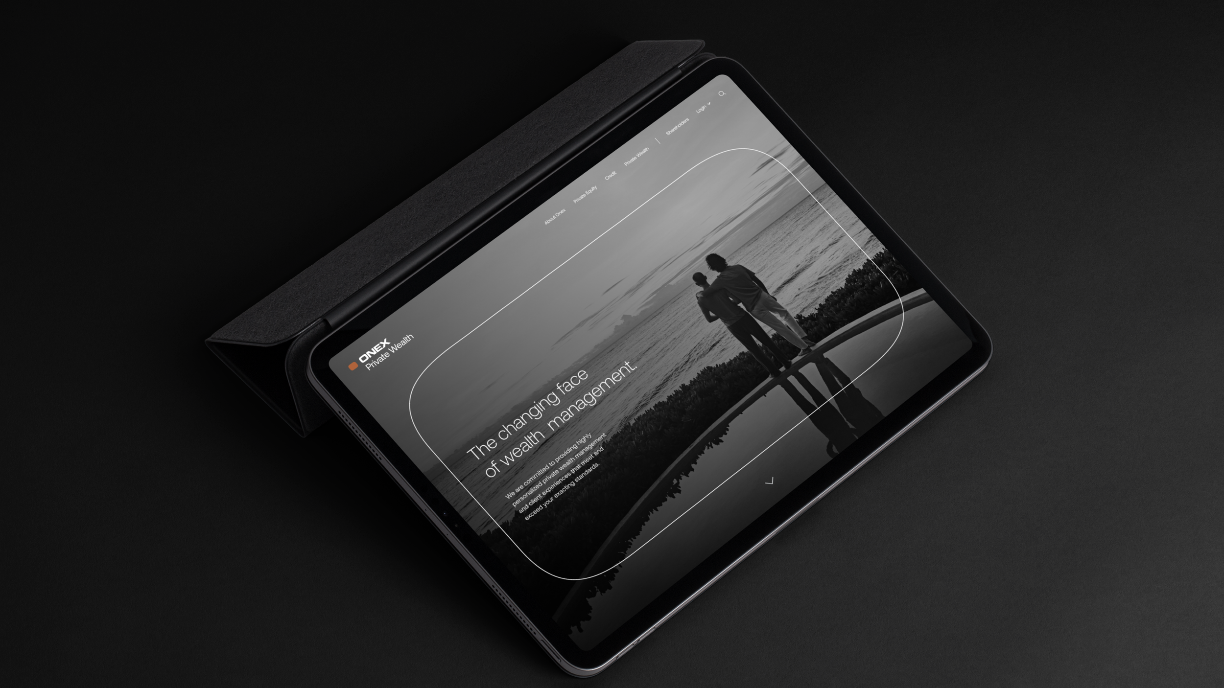
Onex brand identity Onex logo design Onex brand campaign
Onex Branding

A world-class investment firm with a brand that hadn't kept pace. The rebrand modernized the identity without abandoning the equity in its mark — building a more flexible system for a digitally-focused era.

See Project
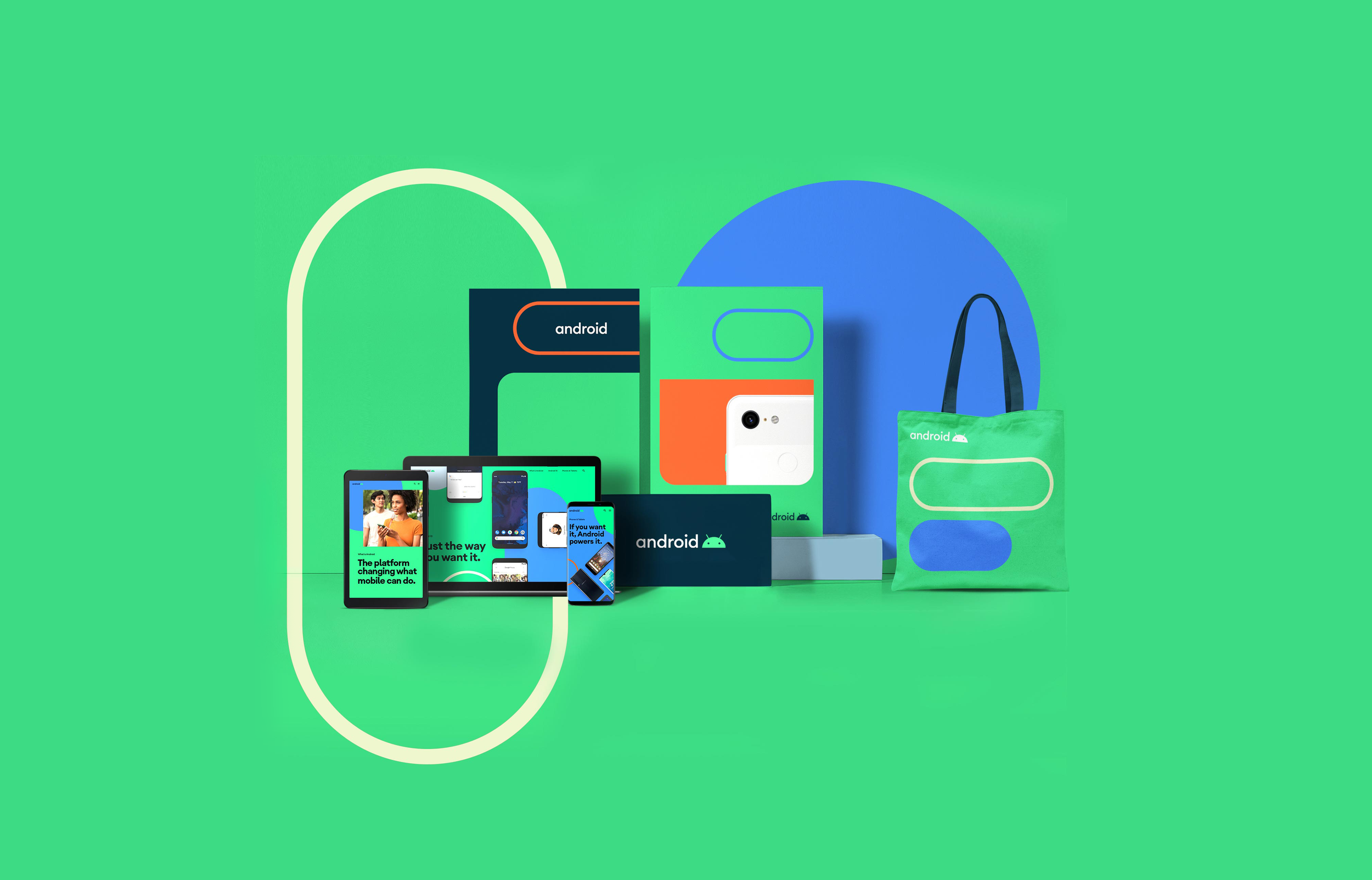
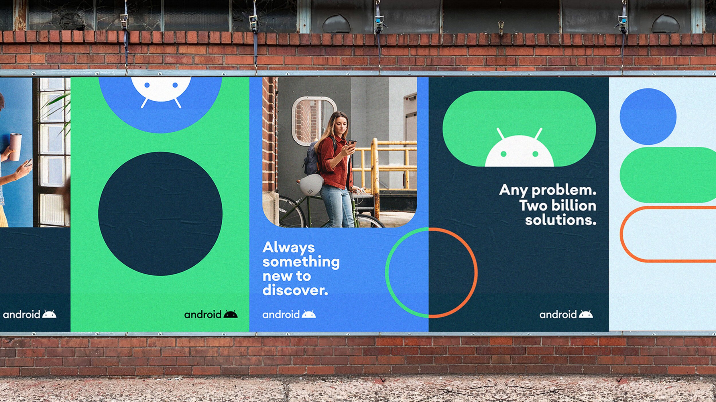
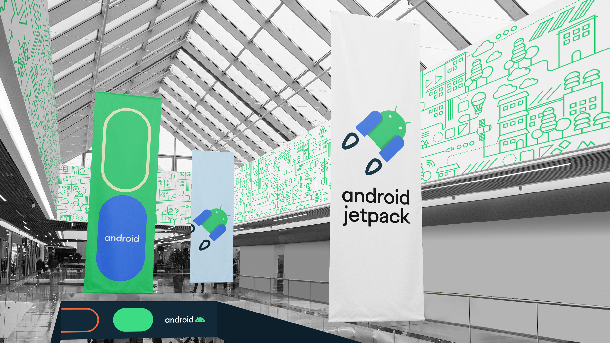
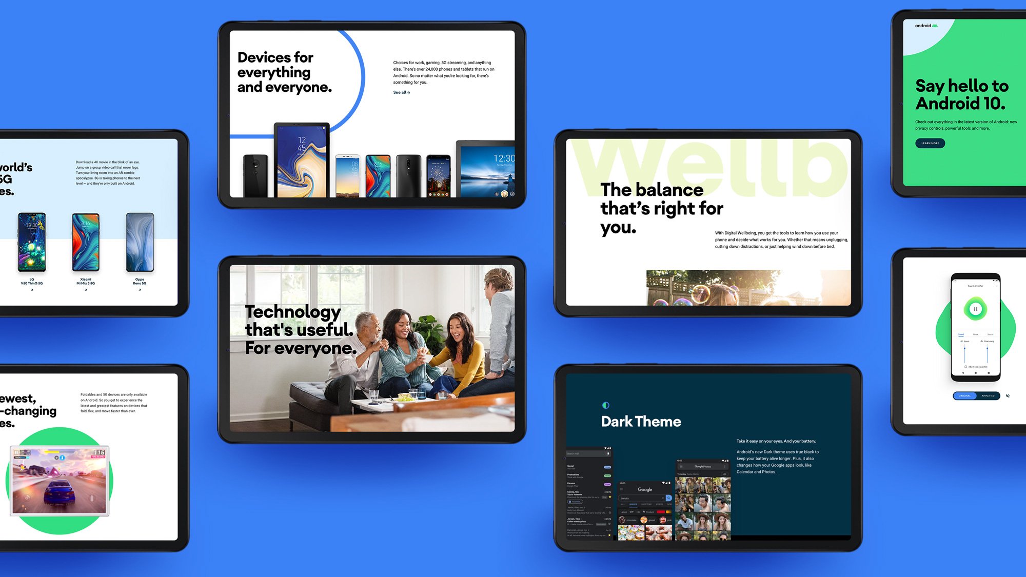
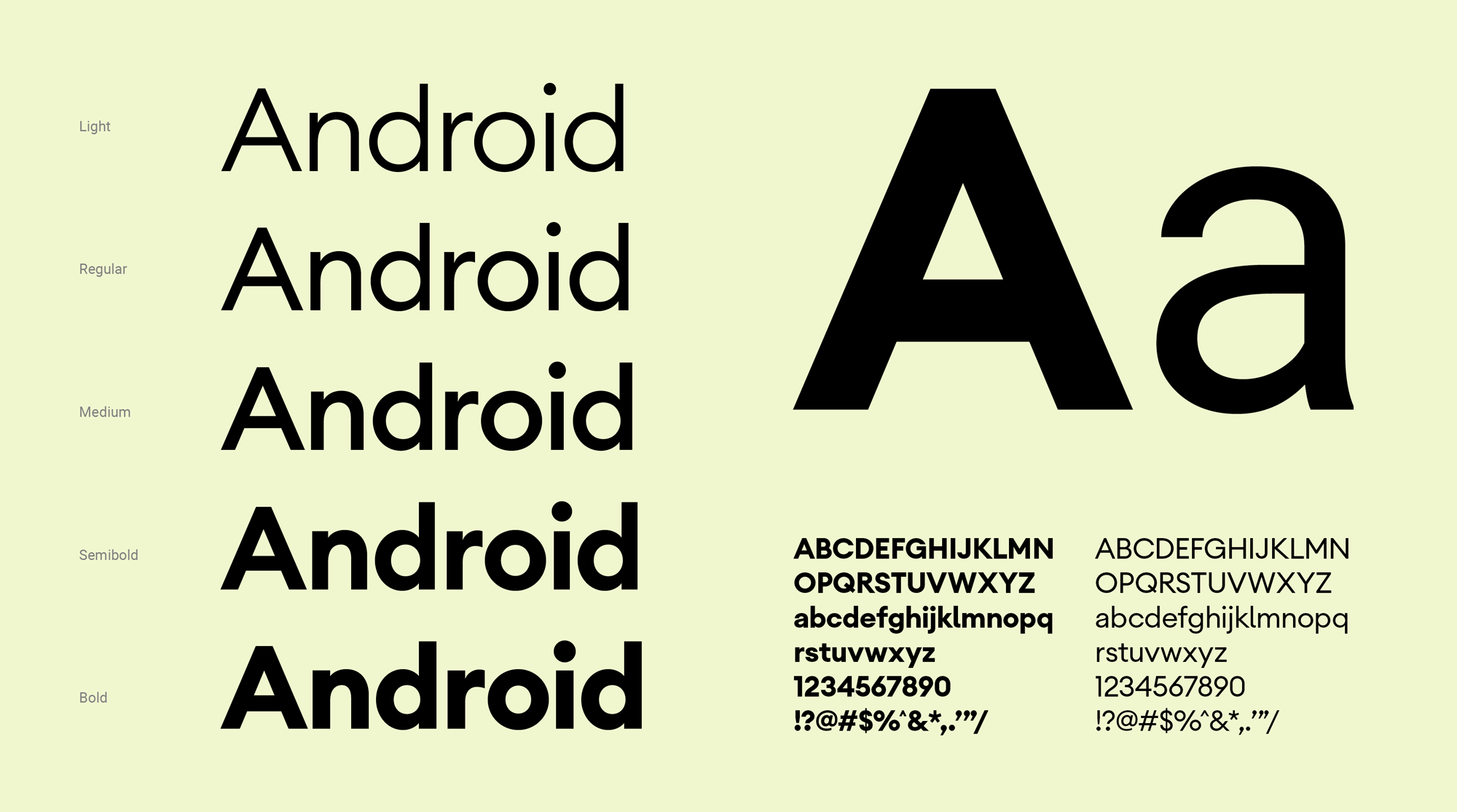
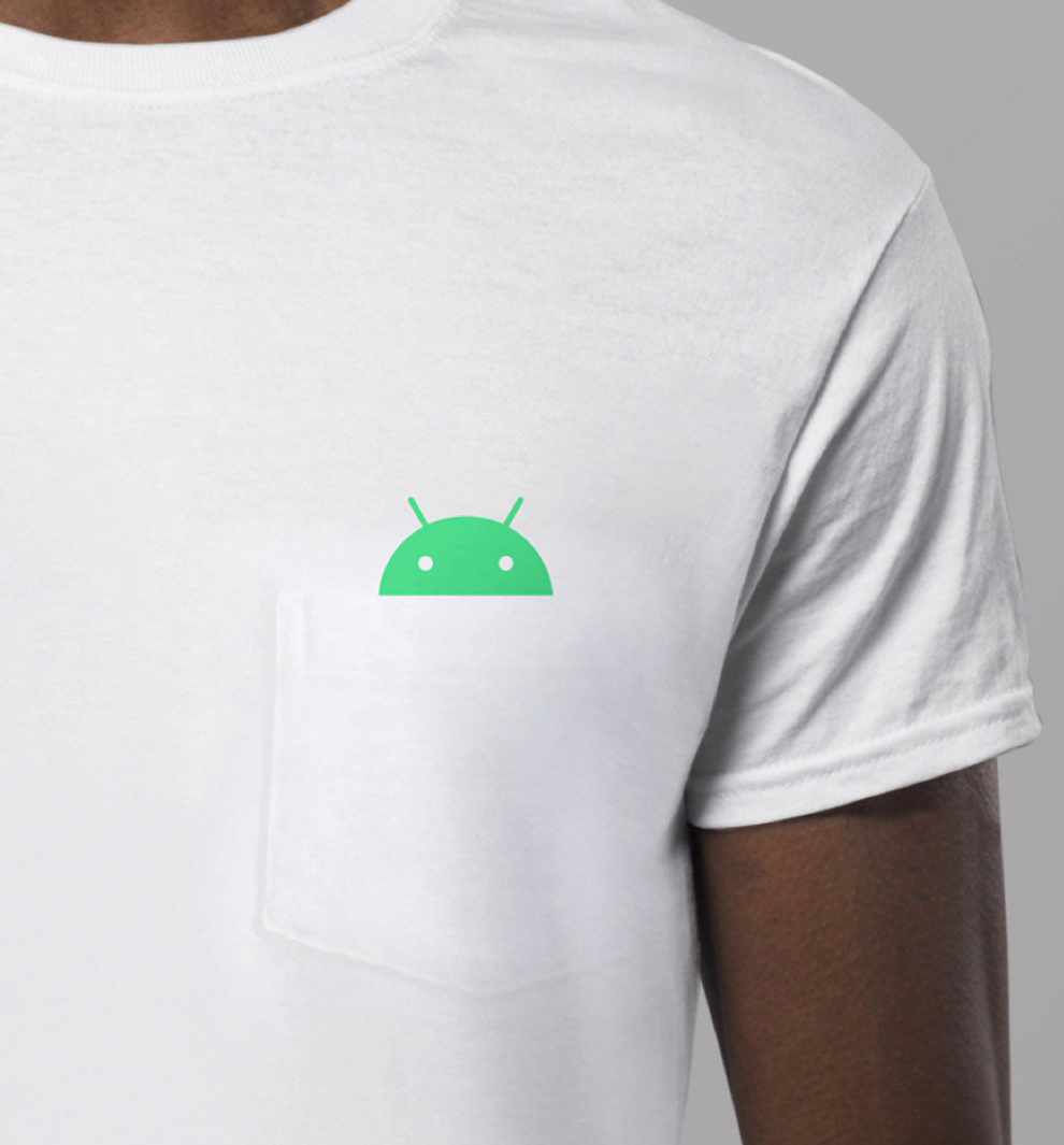
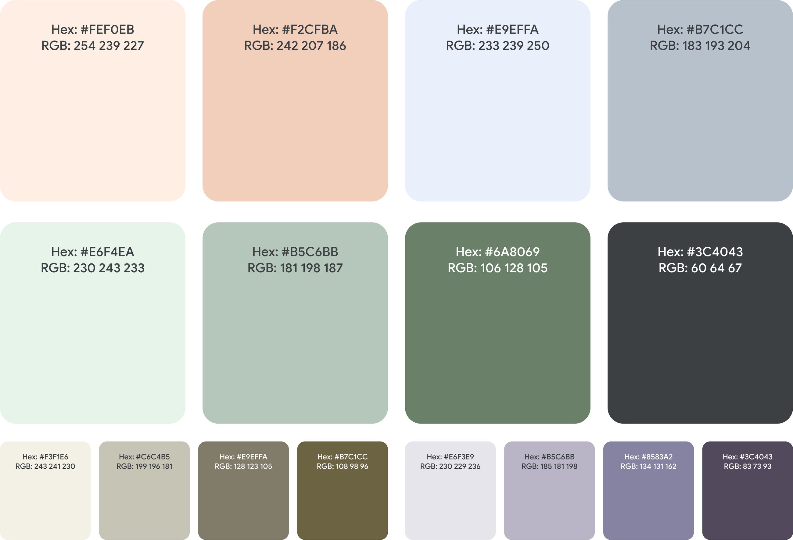
Android brand identity Android brand illustrations Android colour system
Android Branding

Android evolved its visual identity to create a more modern, accessible and inclusive brand for its growing global community. The refresh introduced a refined wordmark, a more expressive robot mark and an expanded colour palette, creating a more cohesive and flexible identity across the Android ecosystem.

See Project
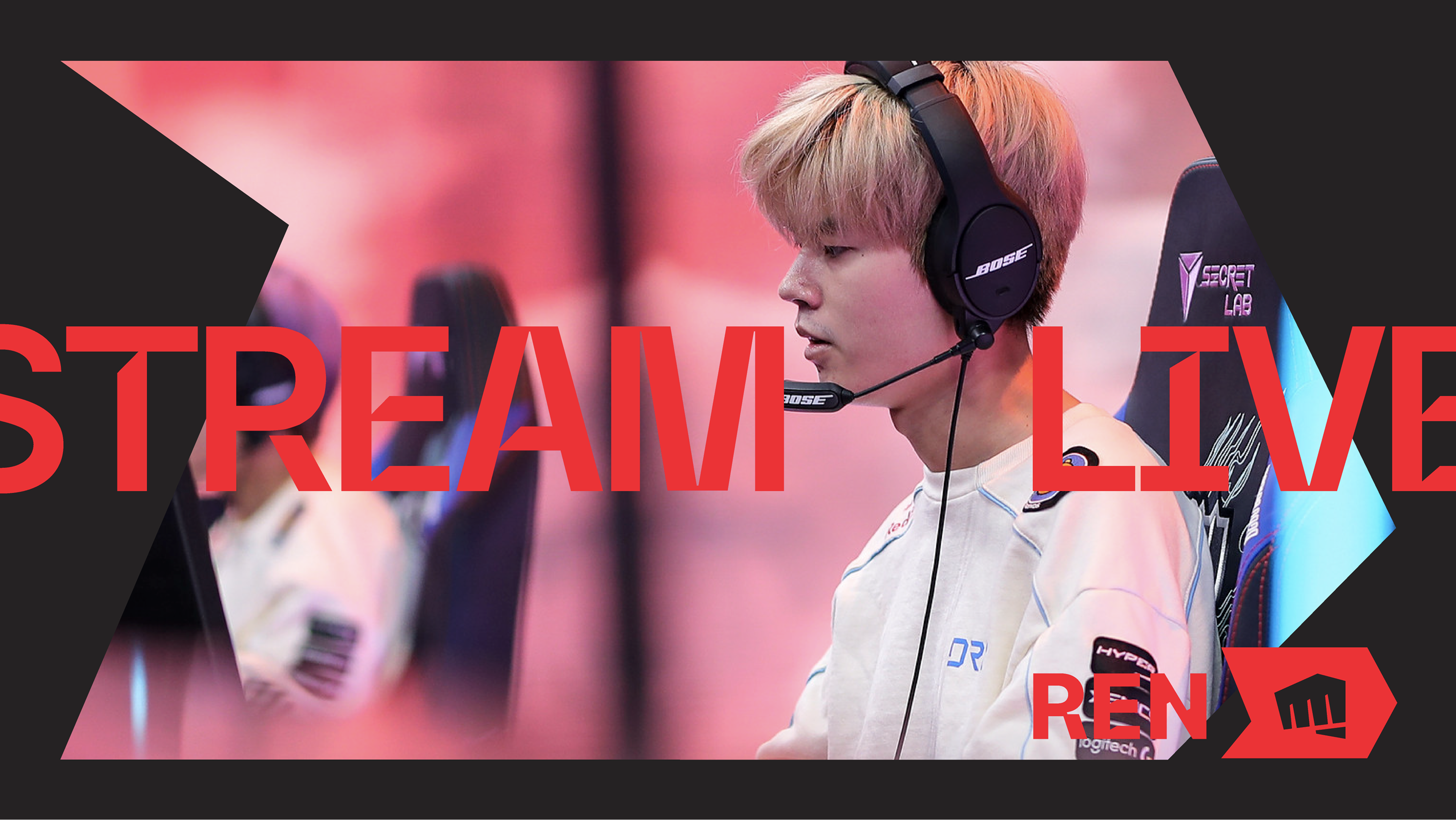
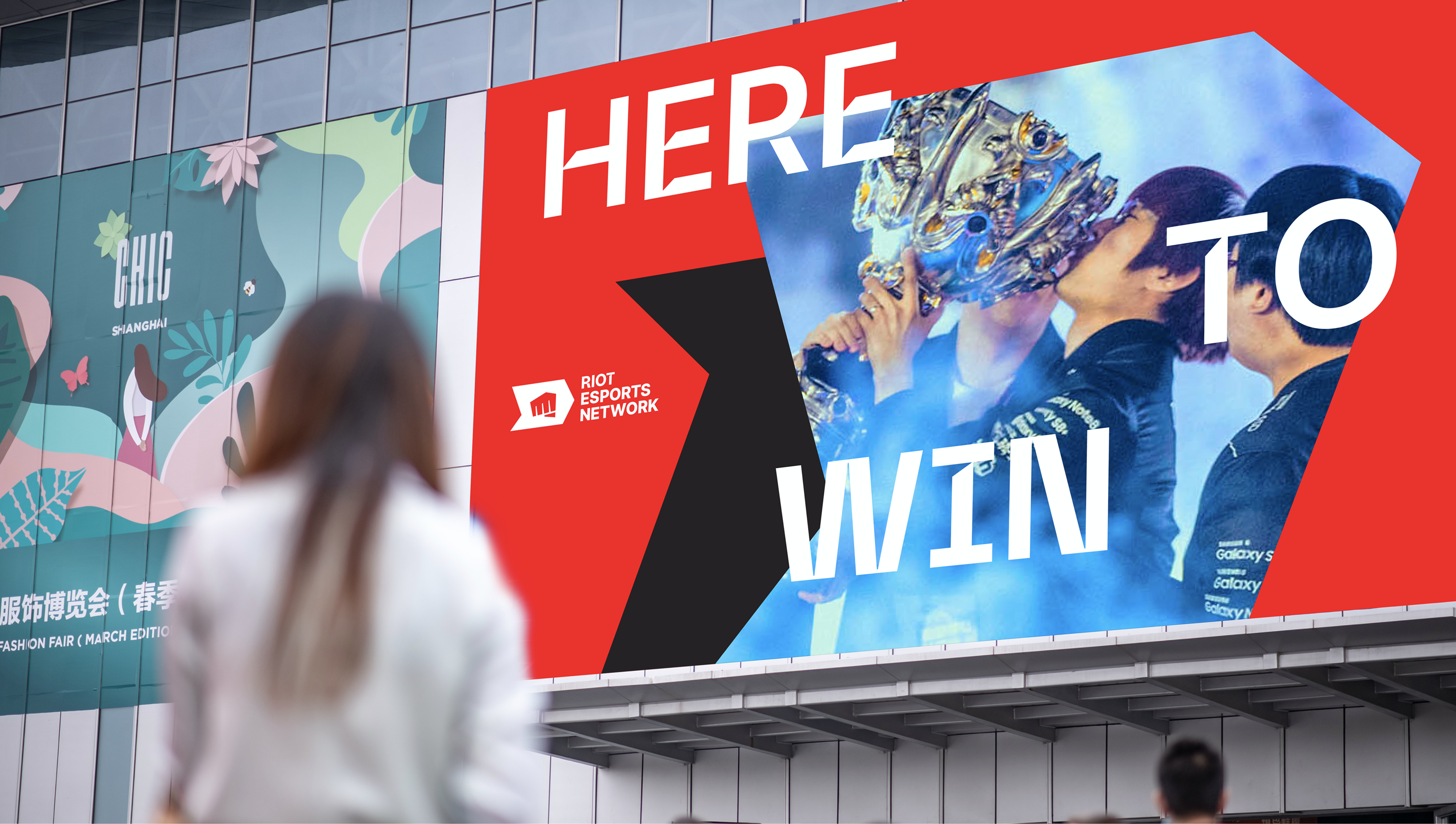
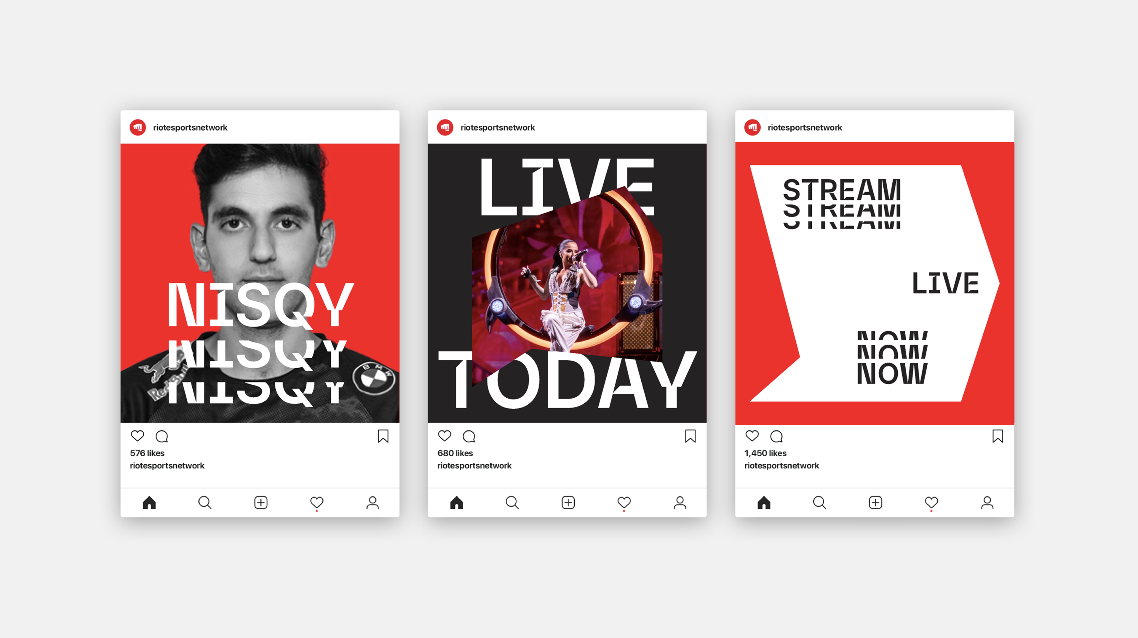
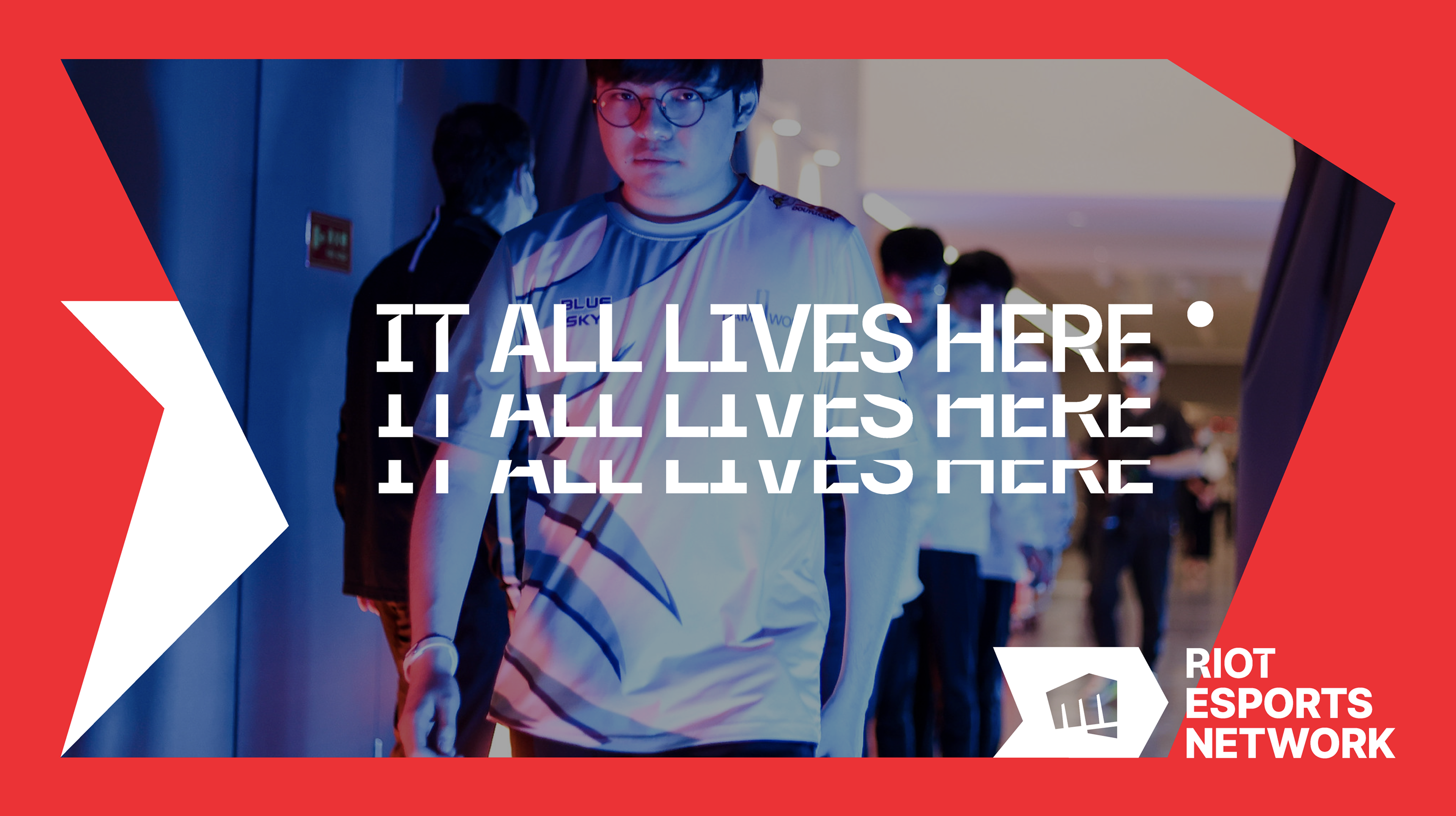
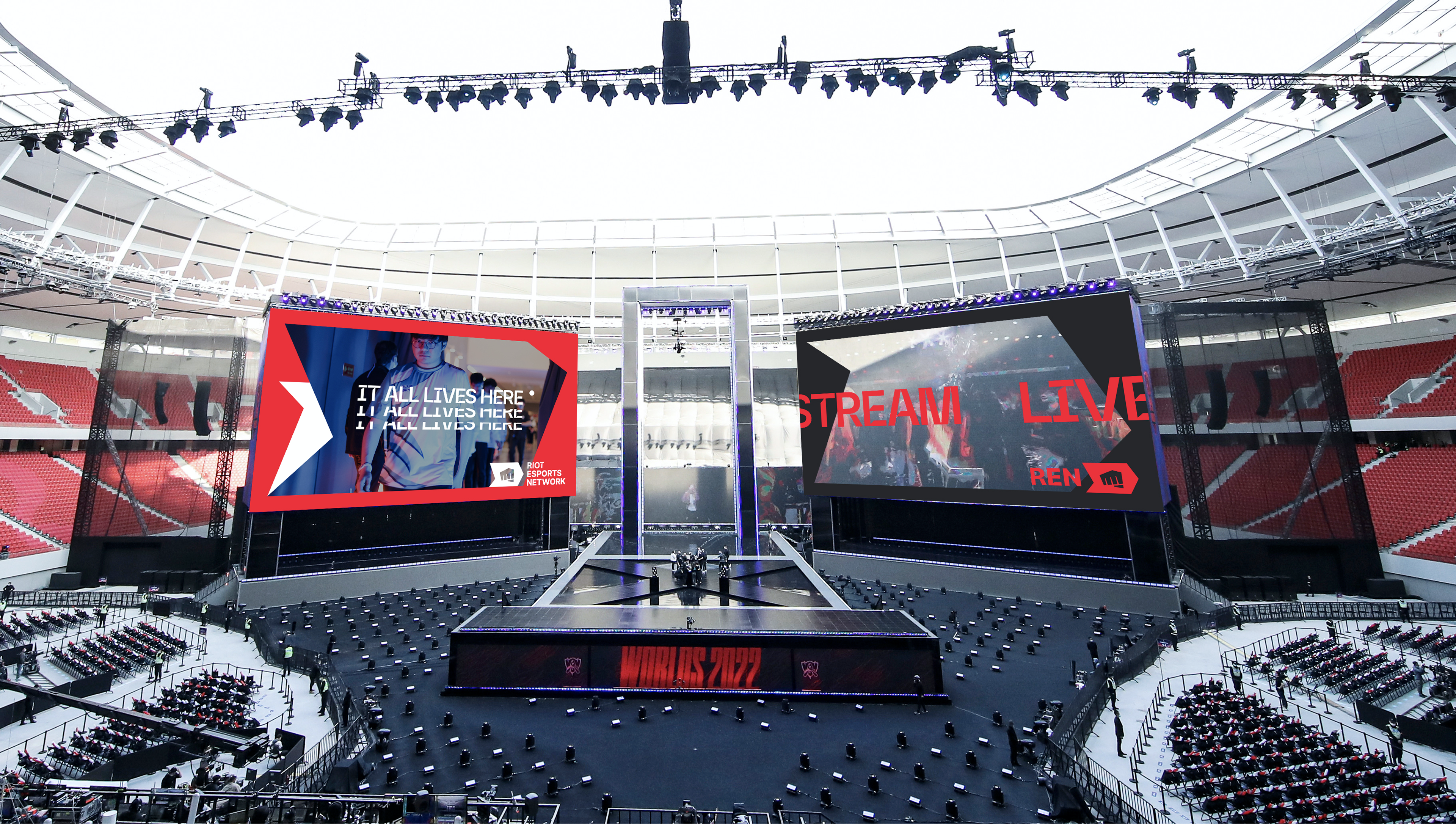
Riot packaging design Riot custom illustrations Riot vibrant color palette
Riot Esports Network Branding

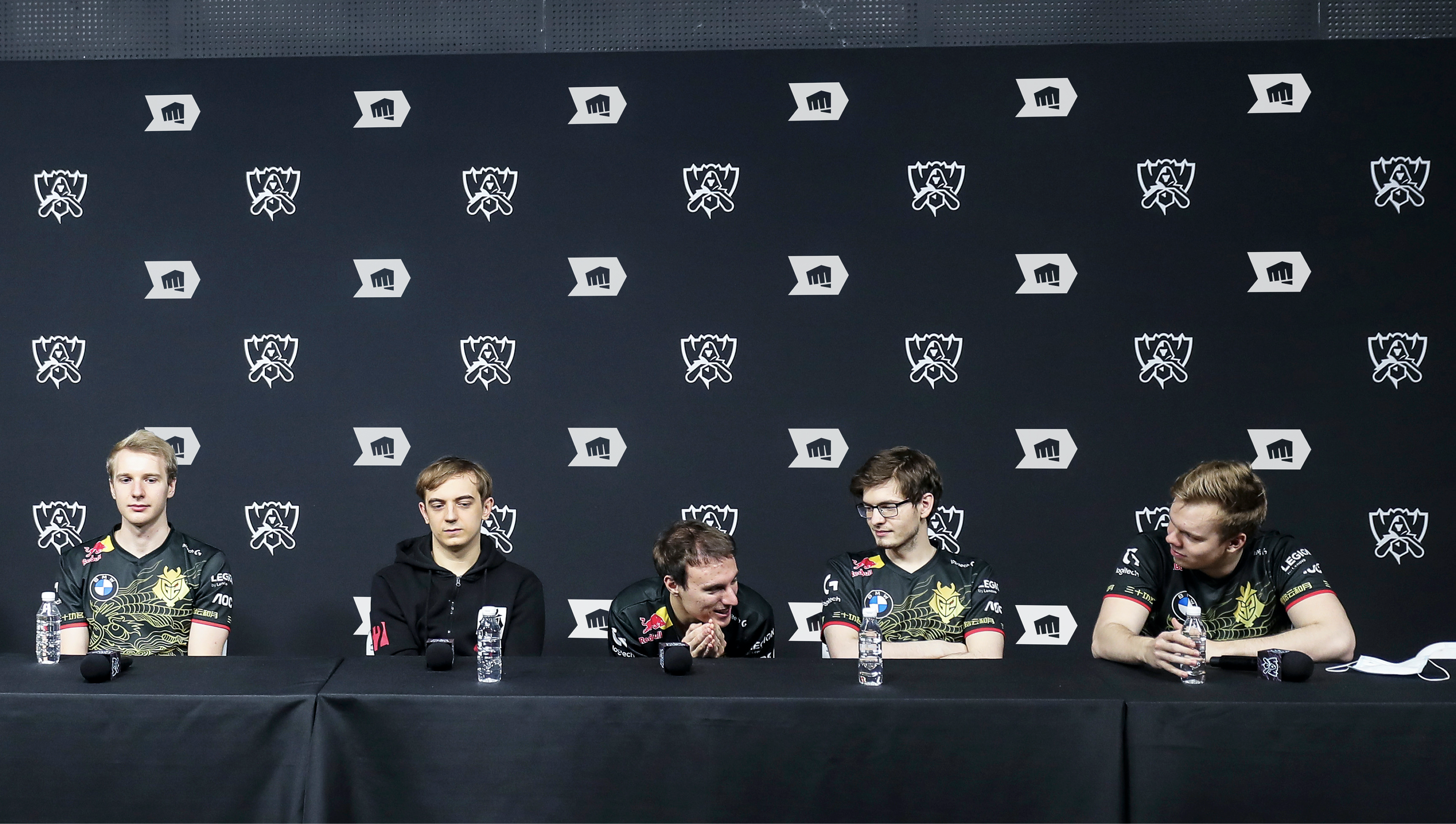
Riot’s esports portfolio had grown into one of the most valuable in the world — but without a unifying brand home. A new identity brought the ecosystem together across broadcast, digital and live event environments.

See Project
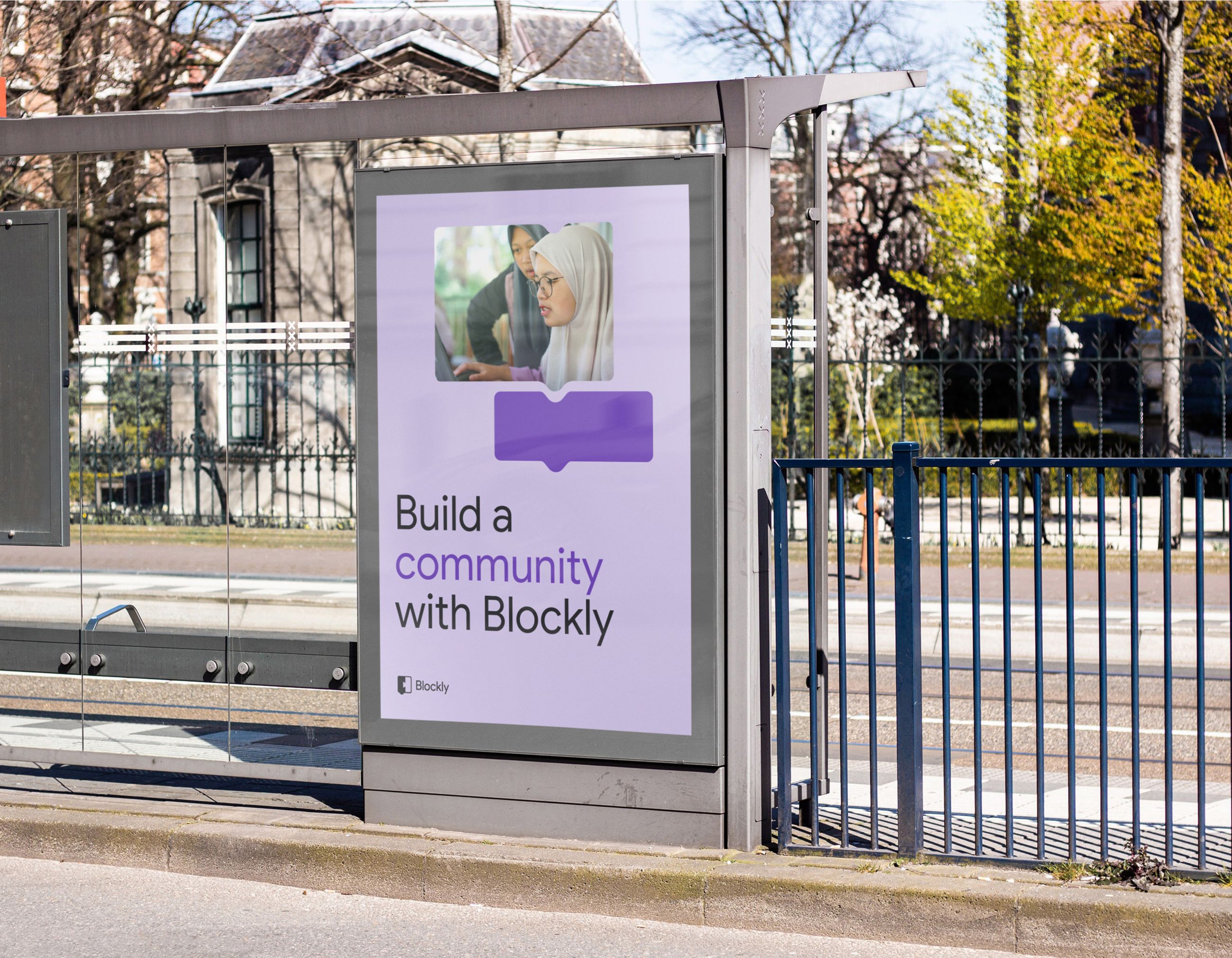
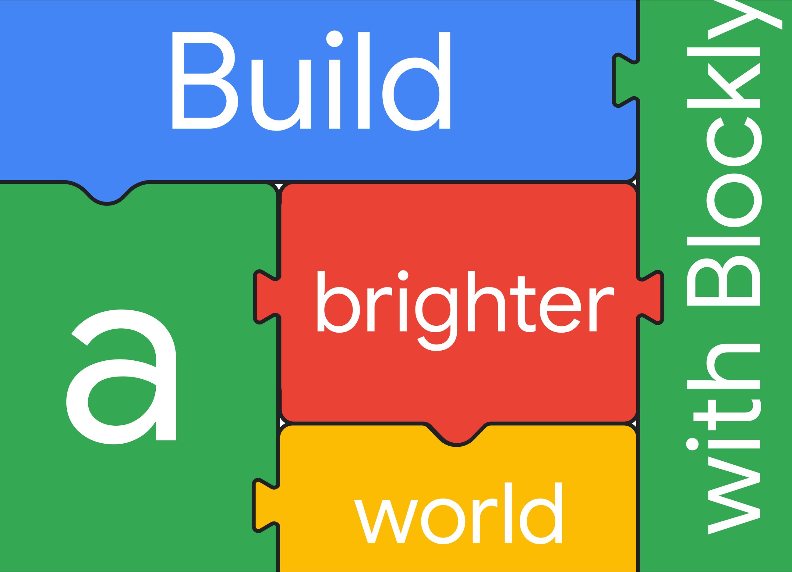
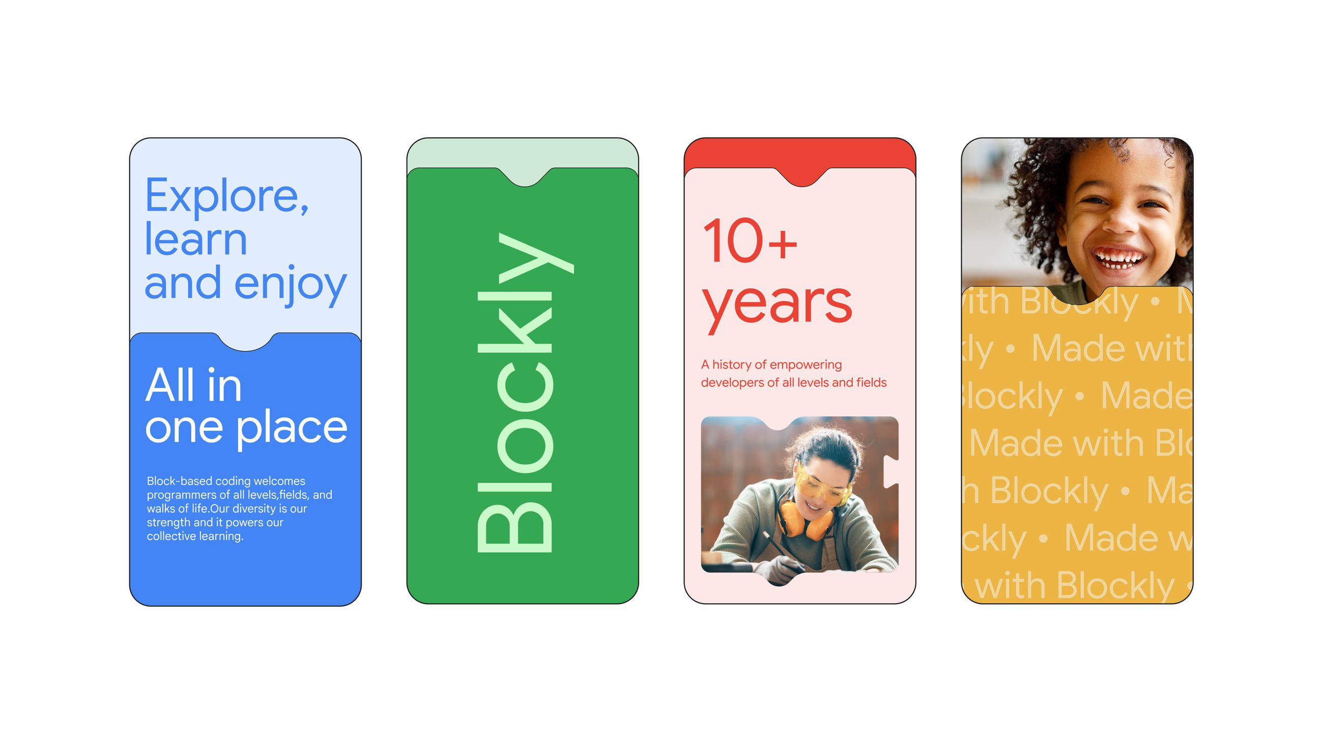
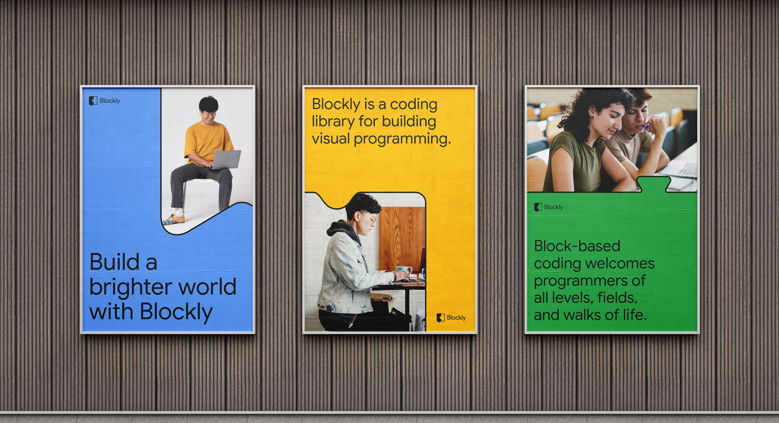
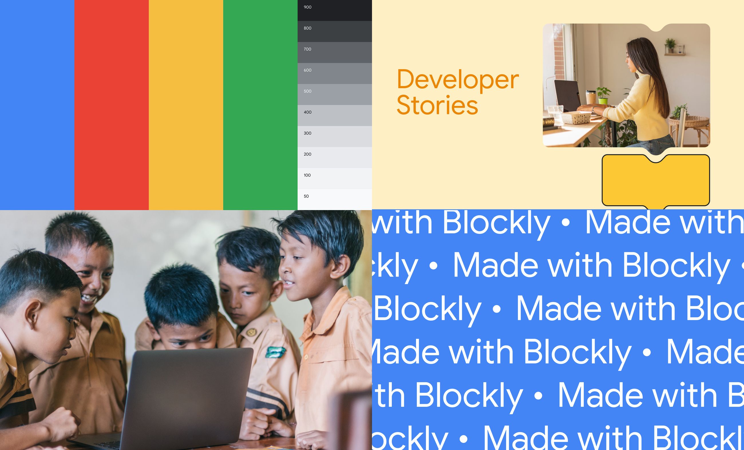
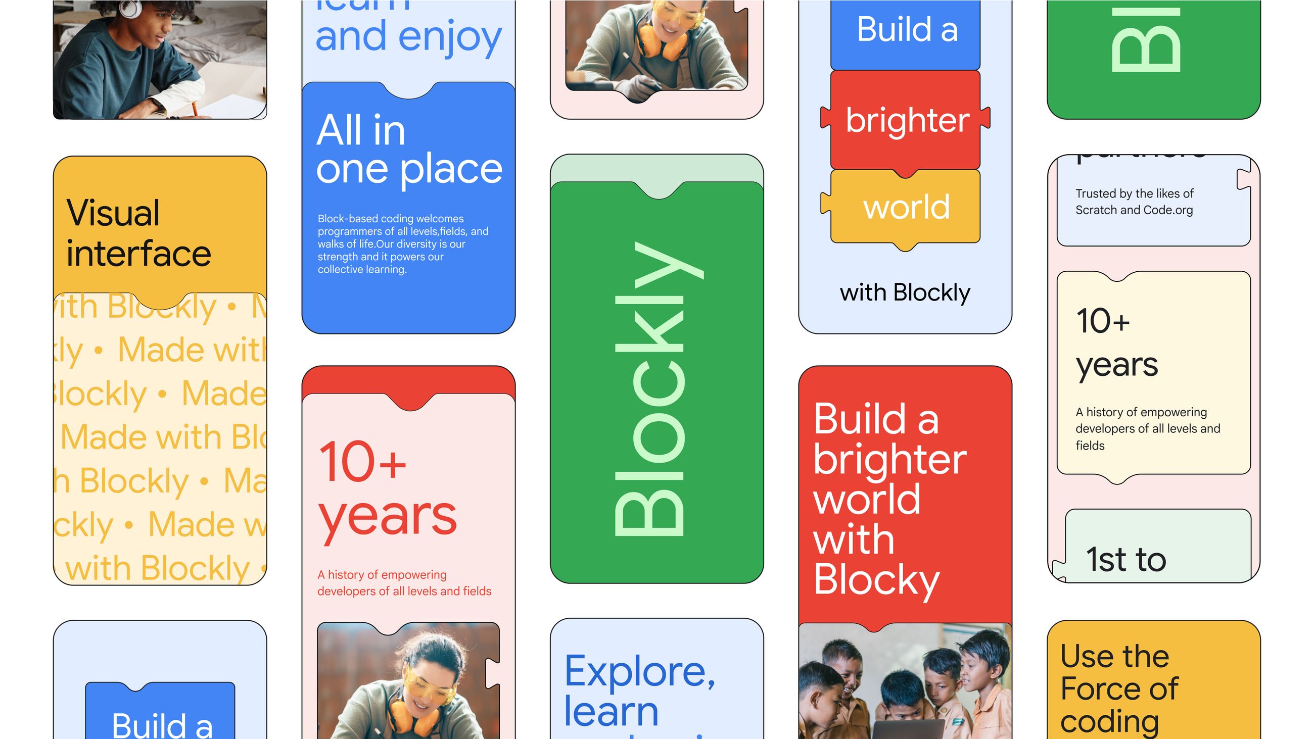
Blockly brand system Blockly typography Blockly brand visual
Blockly Branding · Digital Design

The standard for visual programming education — used by millions worldwide — needed a brand that matched its reach. A new identity and web experience made Blockly feel as creative and accessible as the tool itself.

See Project
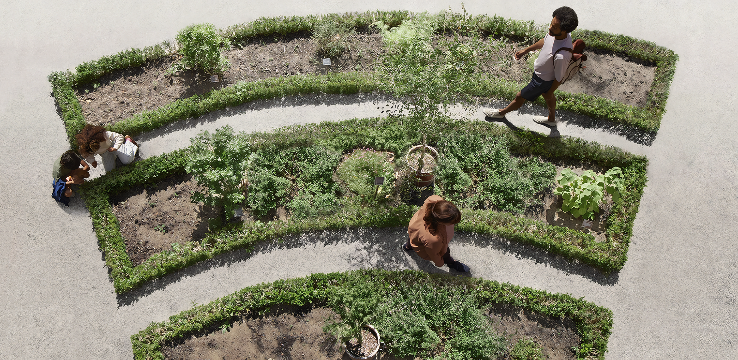
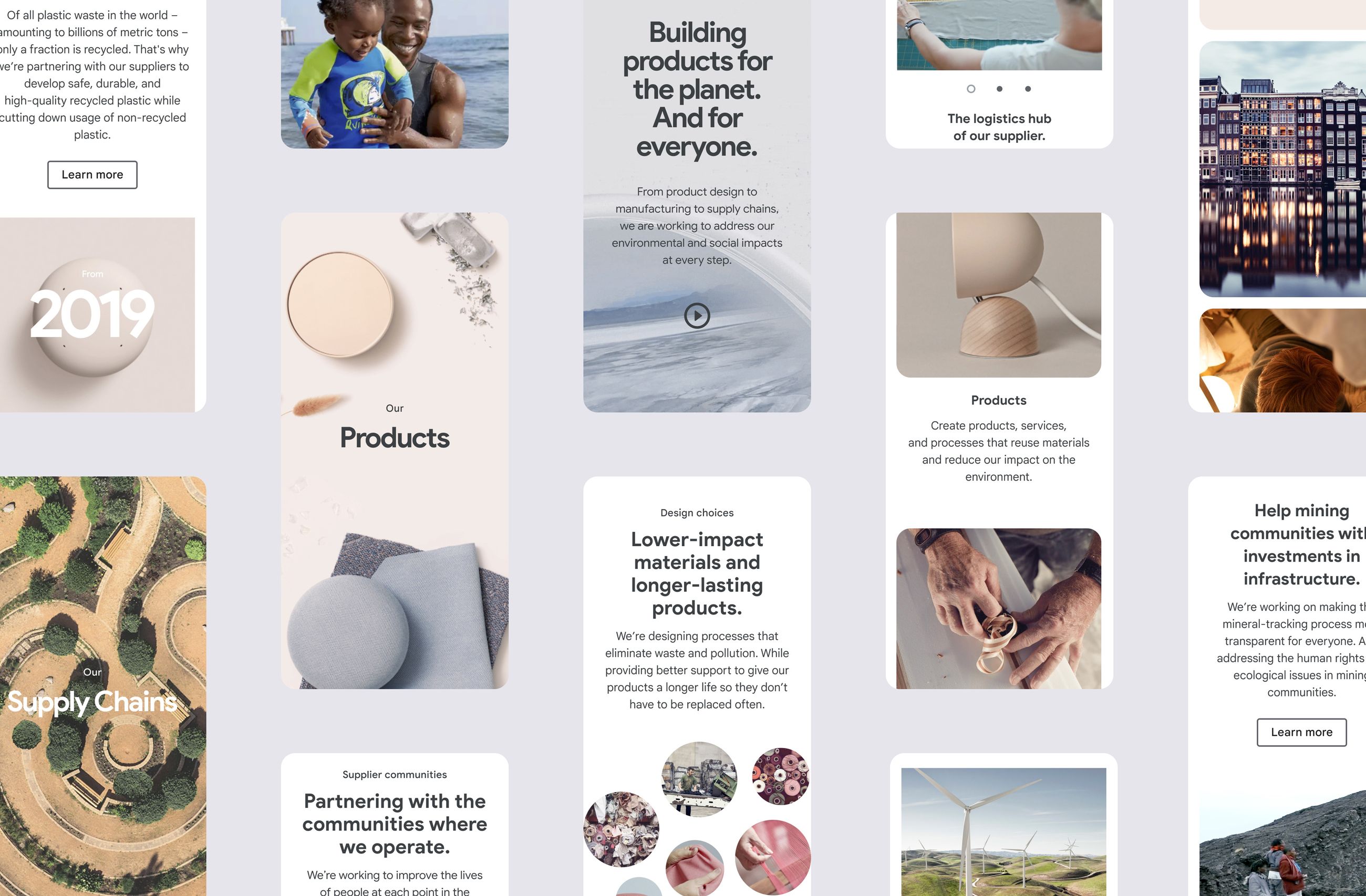
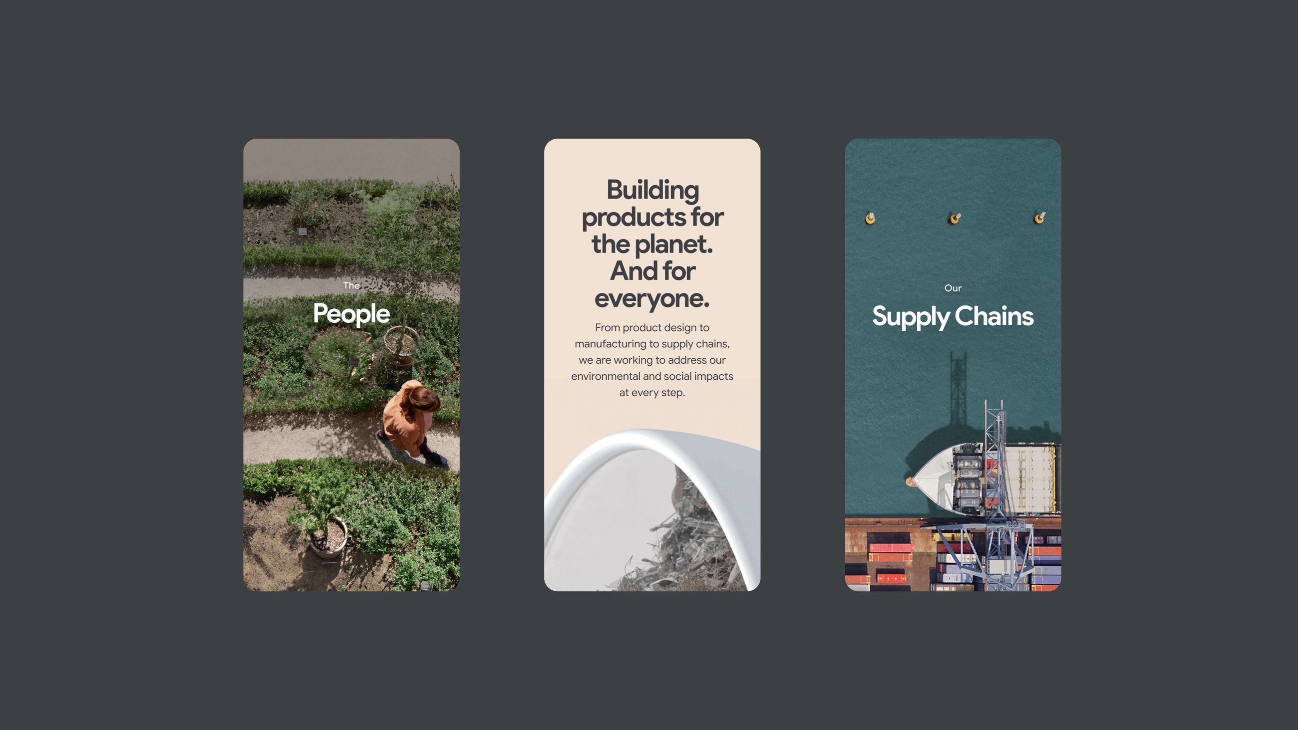
Google packaging design Google custom illustrations Google vibrant color palette
Google Sustainability Art Direction · Digital Experience

Google’s sustainability platform had the data and the ambition — but not a visual language to match. The creative direction defined how photography, colour and composition could make something complex feel human and felt.

See Project
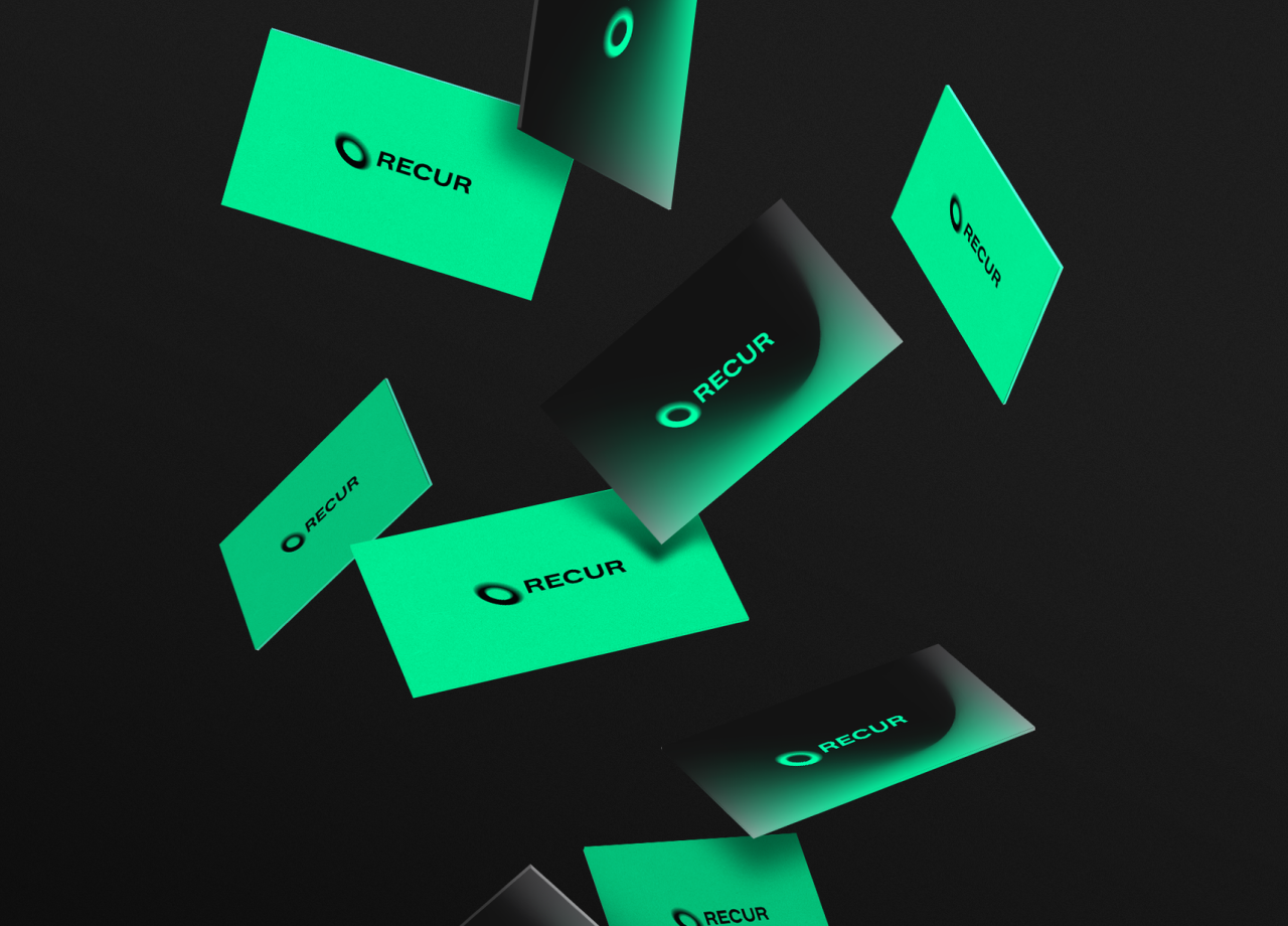
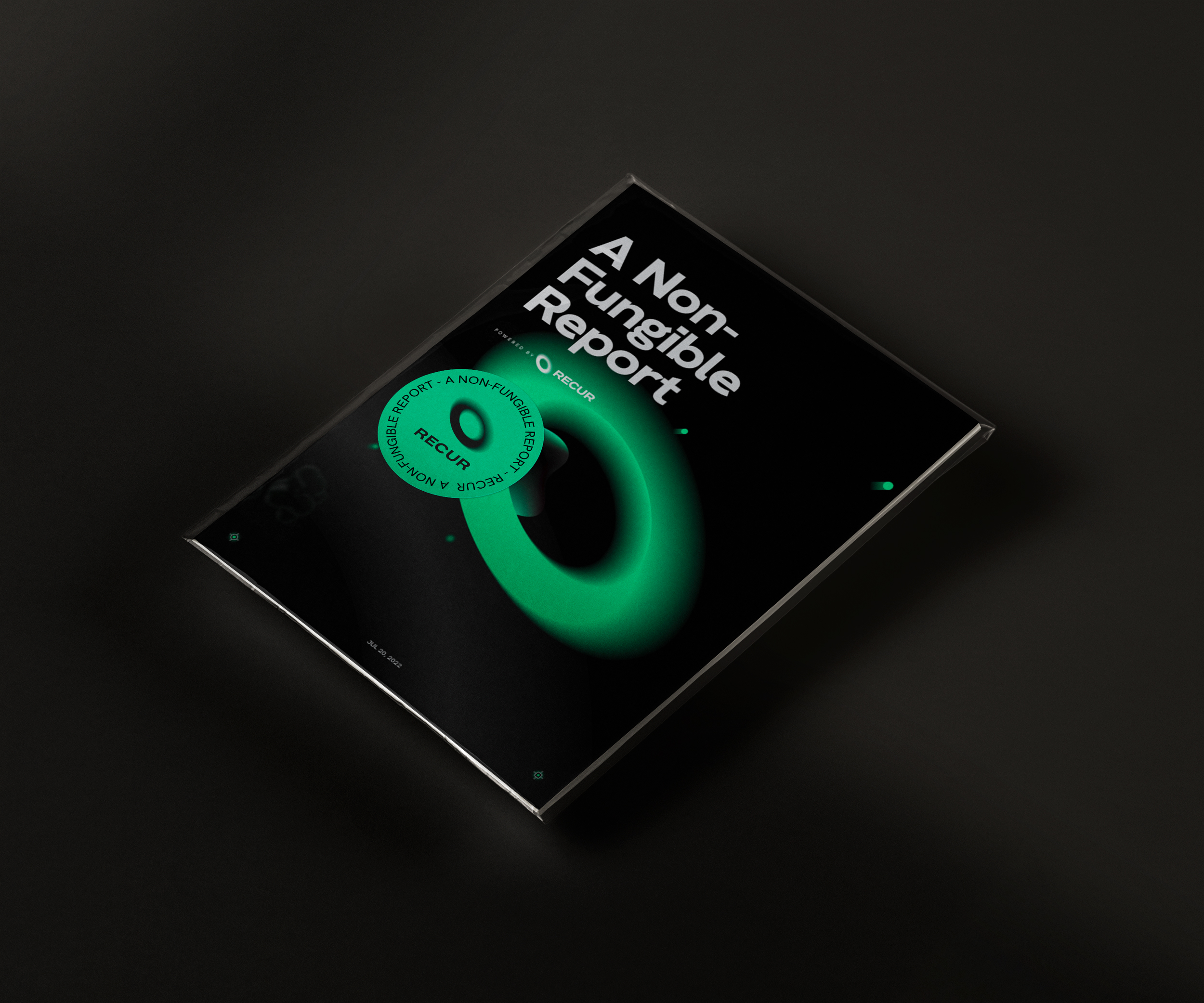
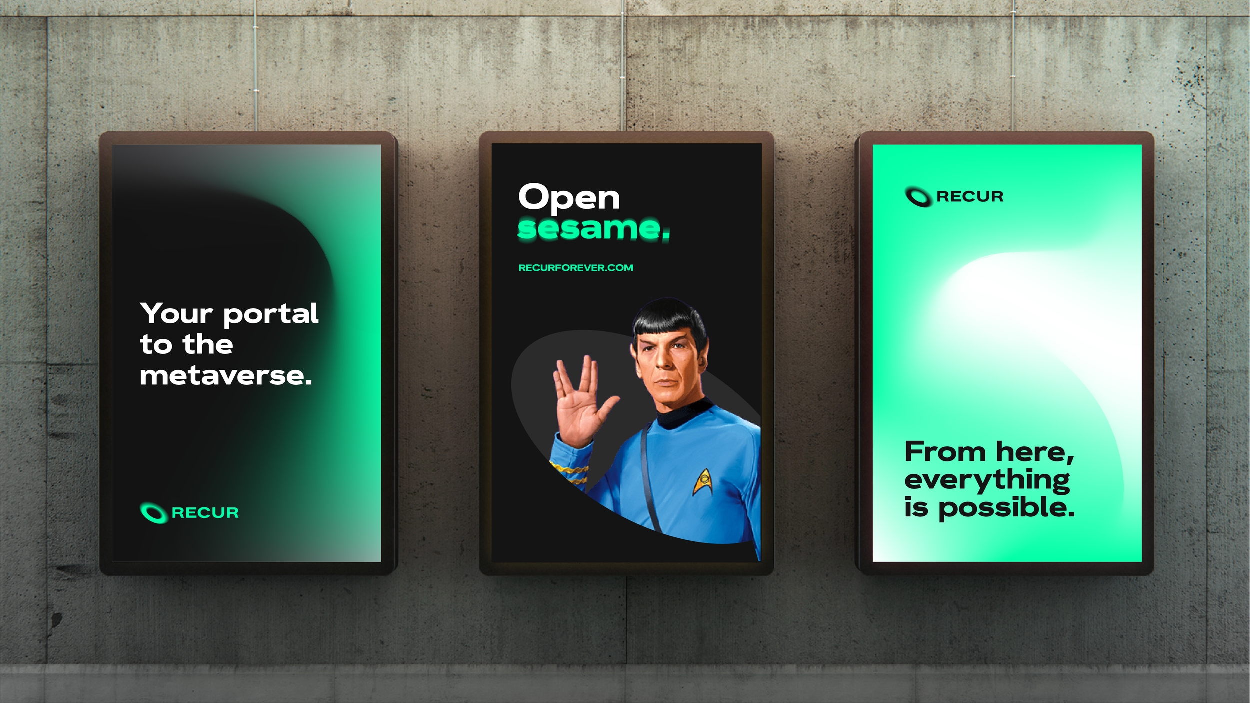
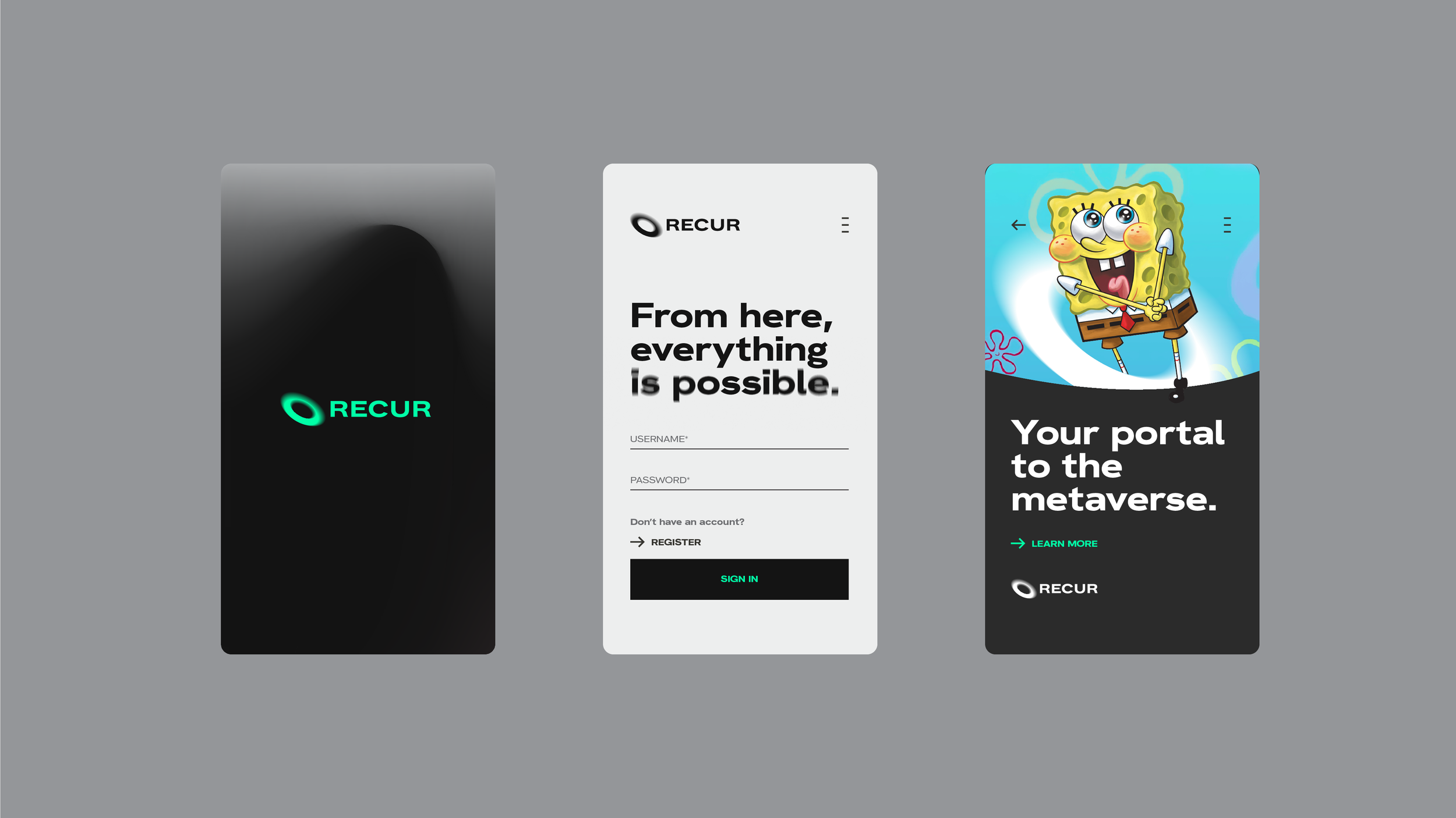
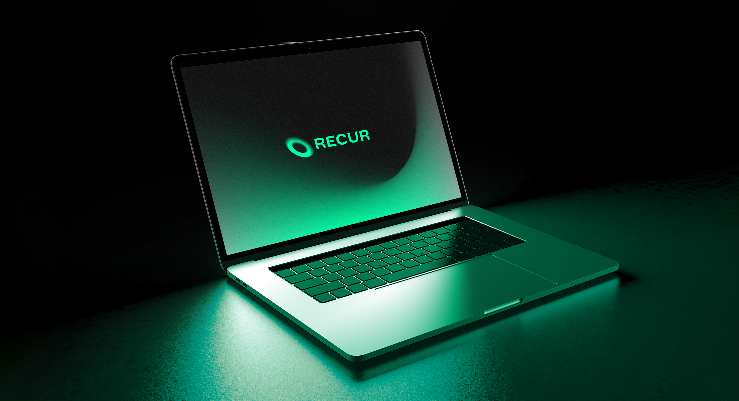
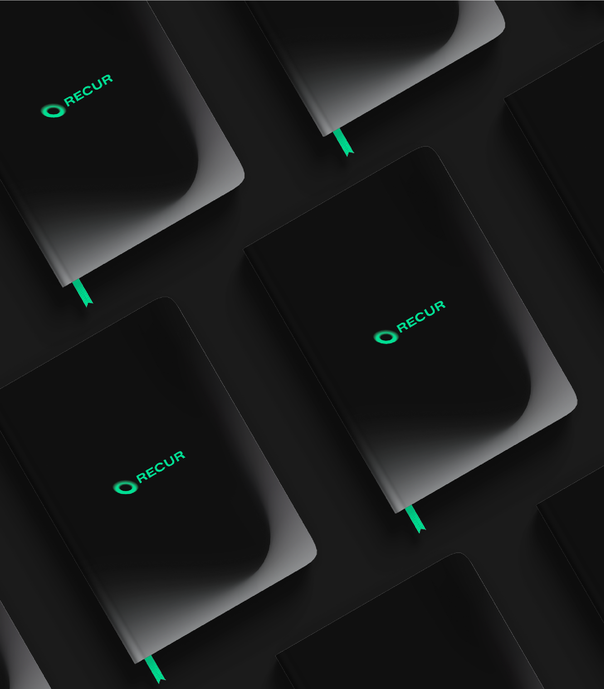
Recur packaging design Recur custom illustrations Recur vibrant color palette
Recur Branding

Recur needed a brand that could make digital collectibles feel legitimate to the world's most recognized IP holders. The identity was built from scratch — expressive, dynamic, and credible enough to close a $50M Series A.

See Project