Ticketmaster
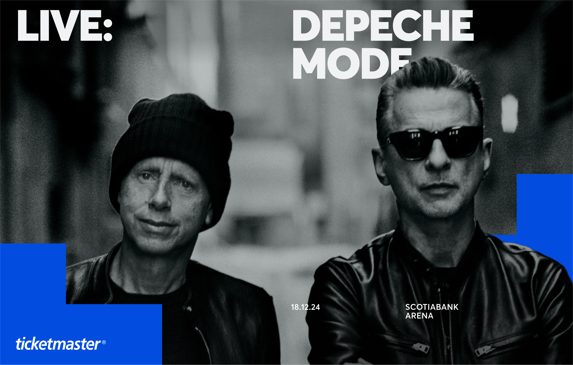
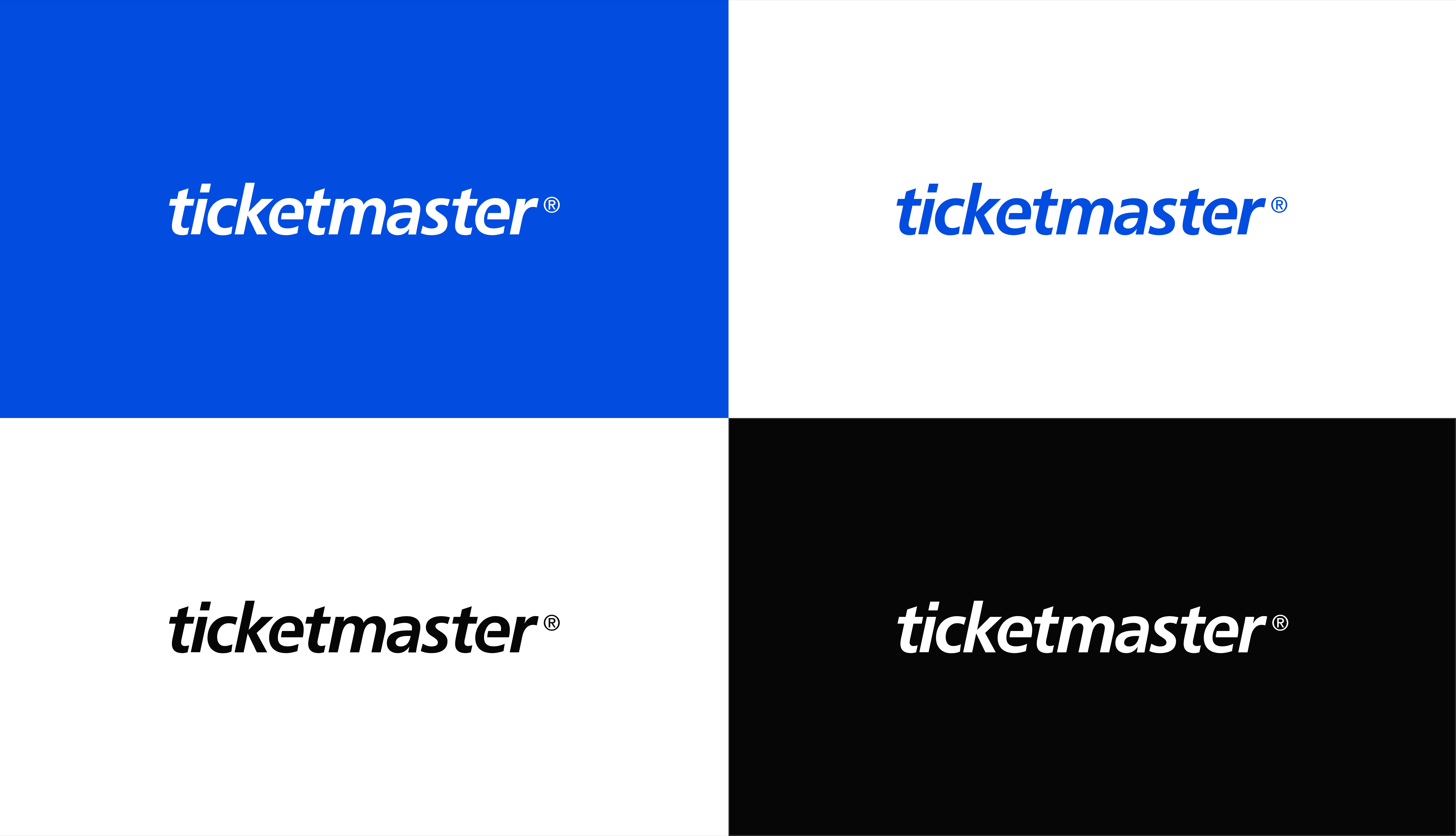
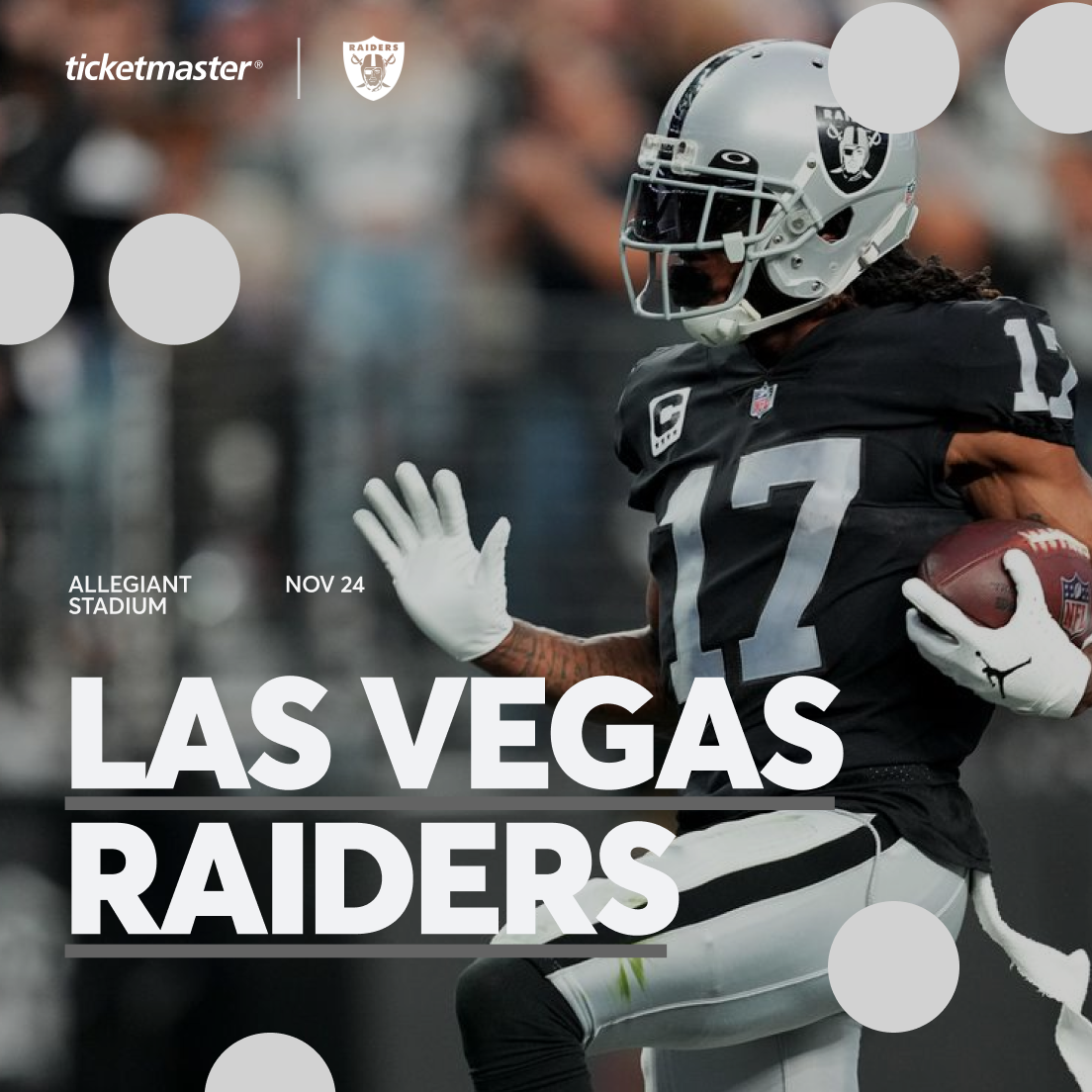
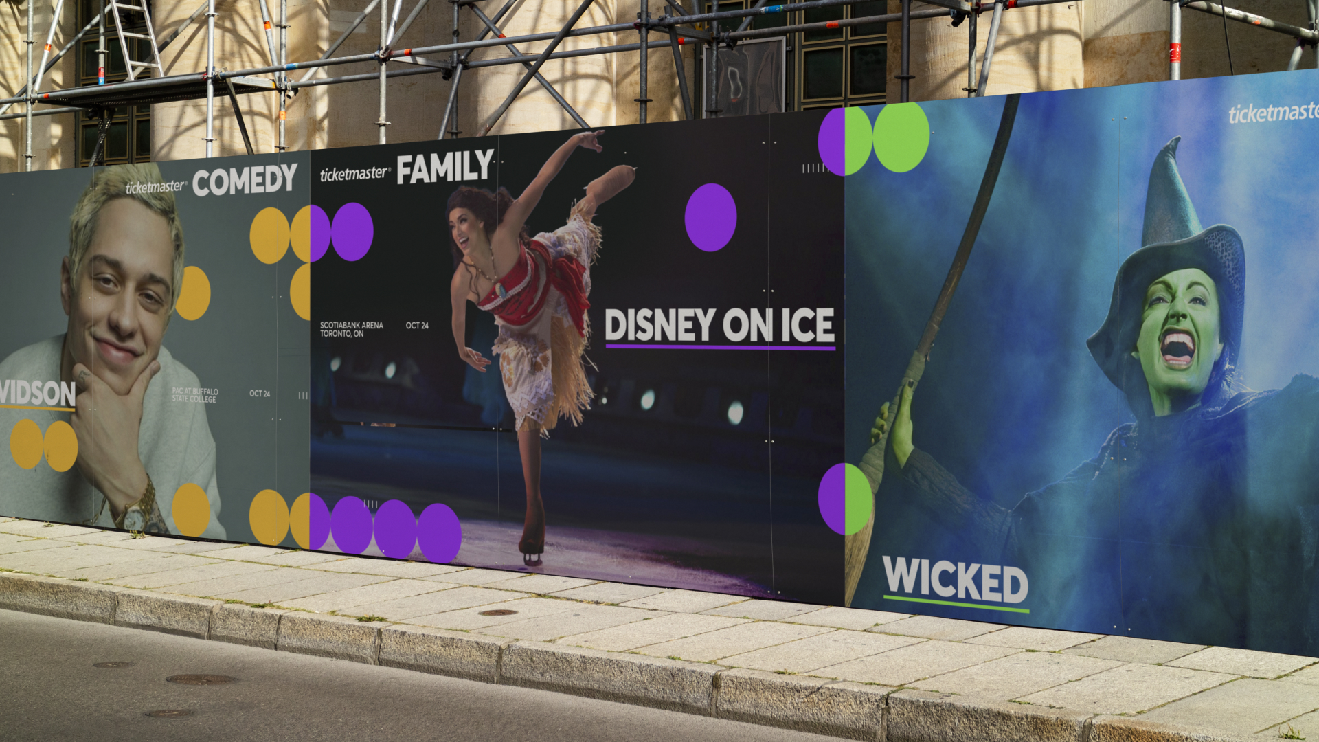
Ticketmaster is one of the most recognized brands in live entertainment — but its visual identity had grown inconsistent, a patchwork of decisions accumulated over decades. The challenge was to build a unified, flexible system that could carry the energy of the brand without losing the recognition equity built into its wordmark and iconic blue. The result is an expressive visual language anchored in an expanded colour spectrum and a typographic system designed to scale across partnerships, formats and global markets.





Spotlight



The Reveal